160 years
of excellent
quality
Let’s talk
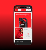
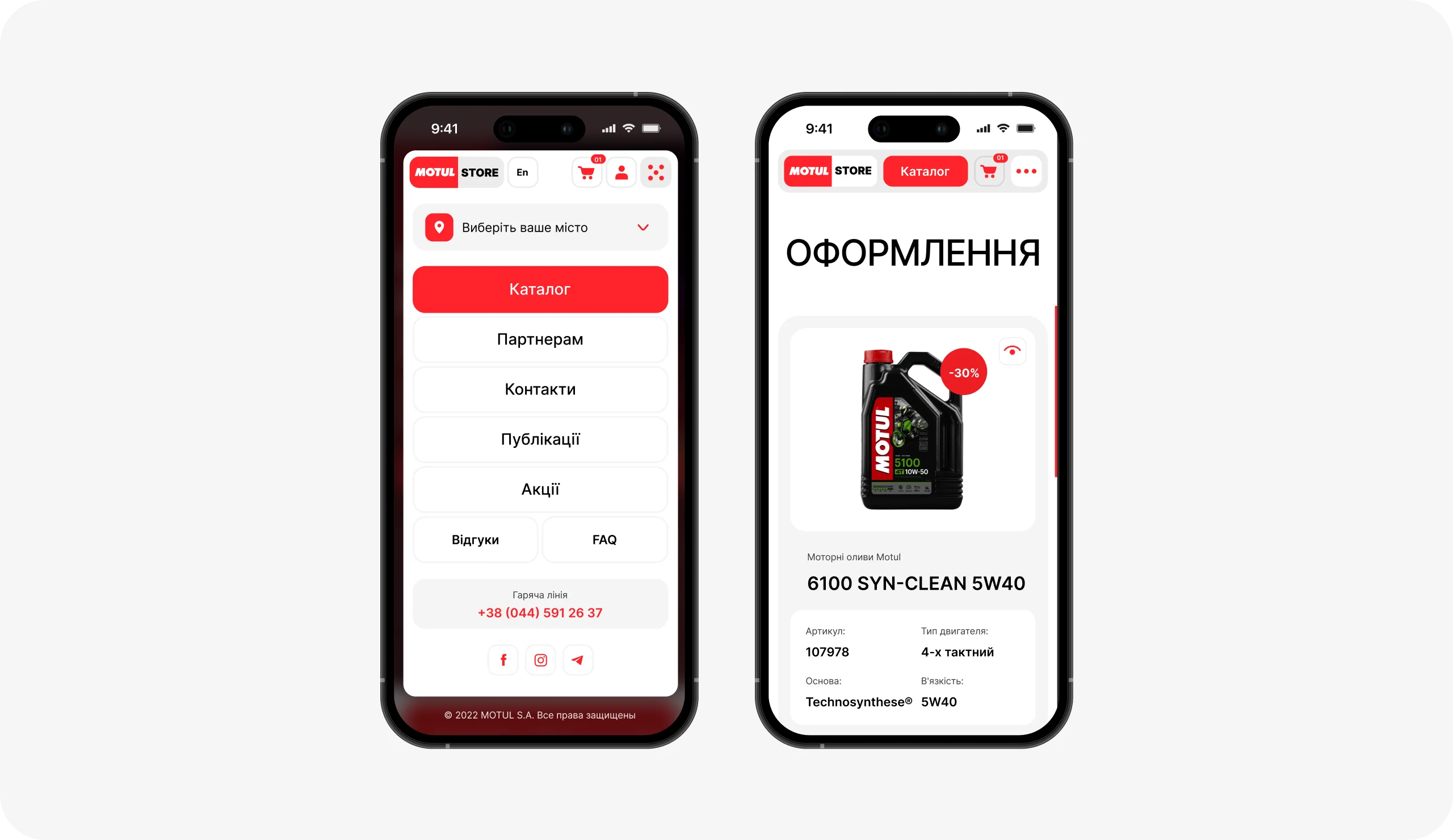
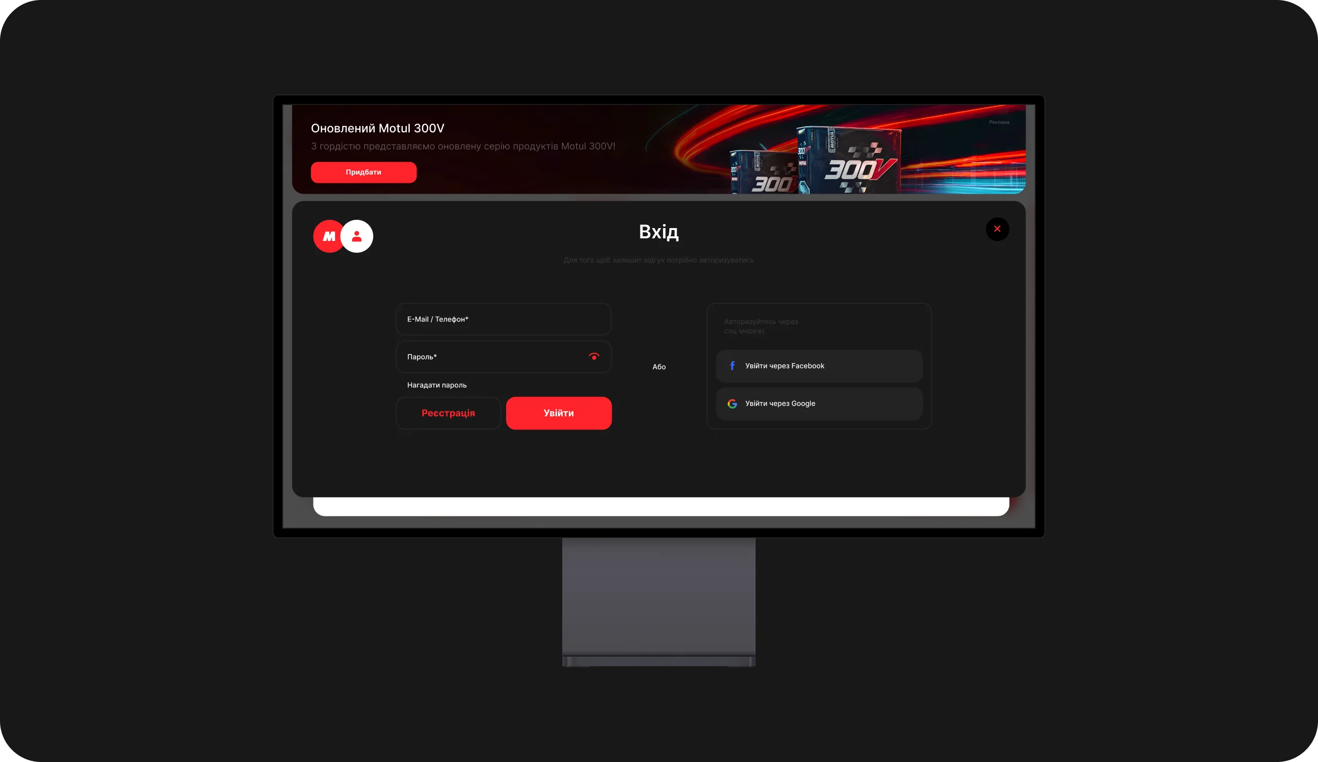
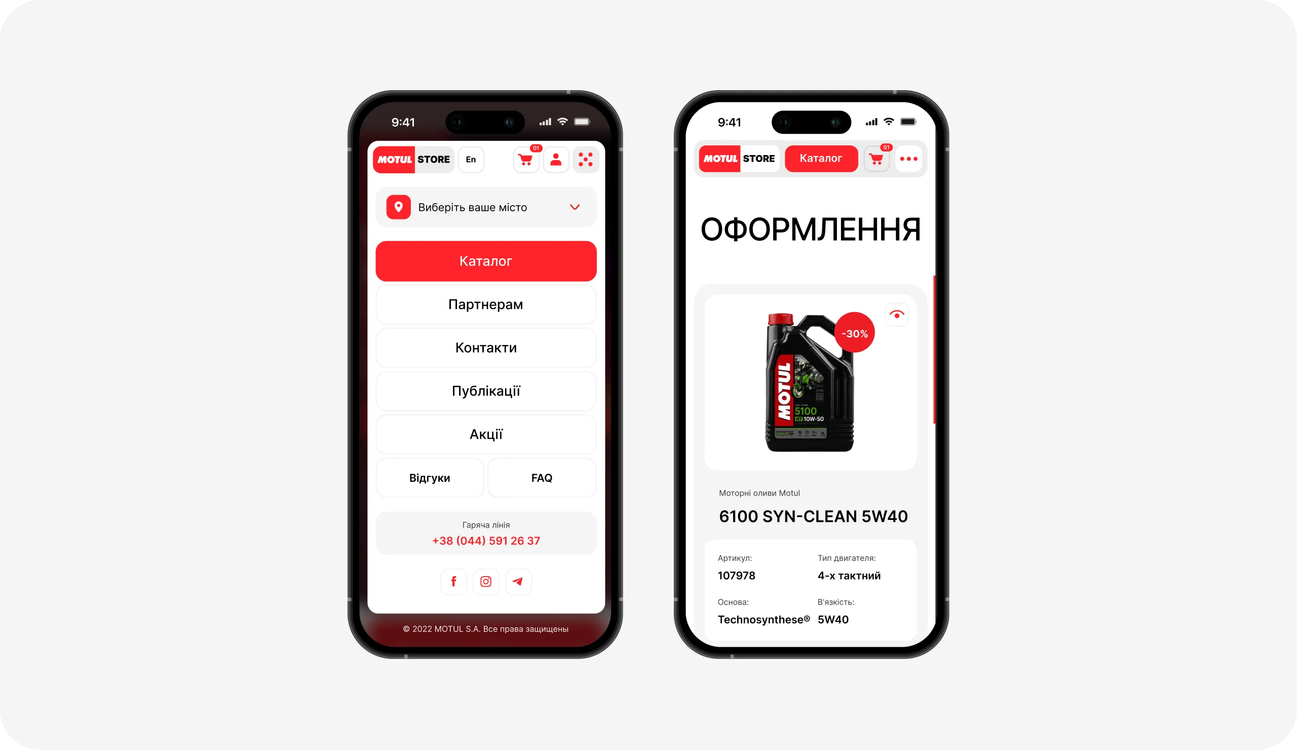
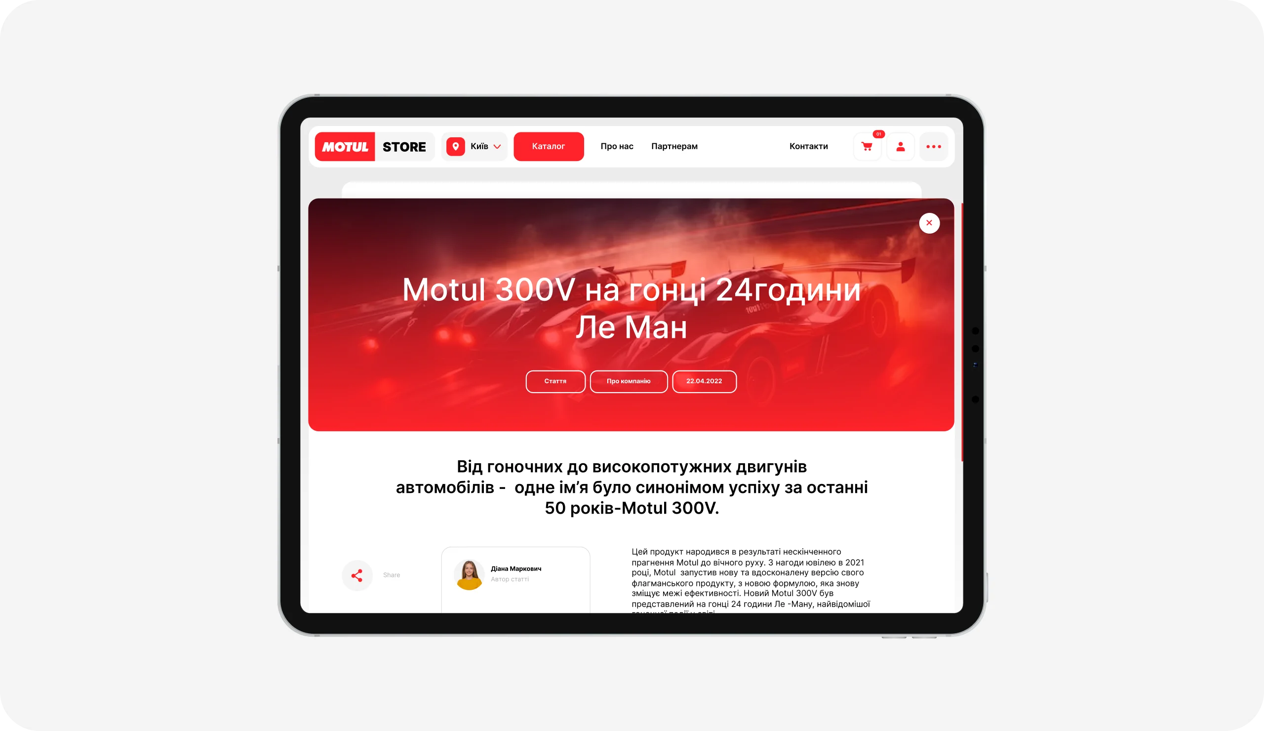
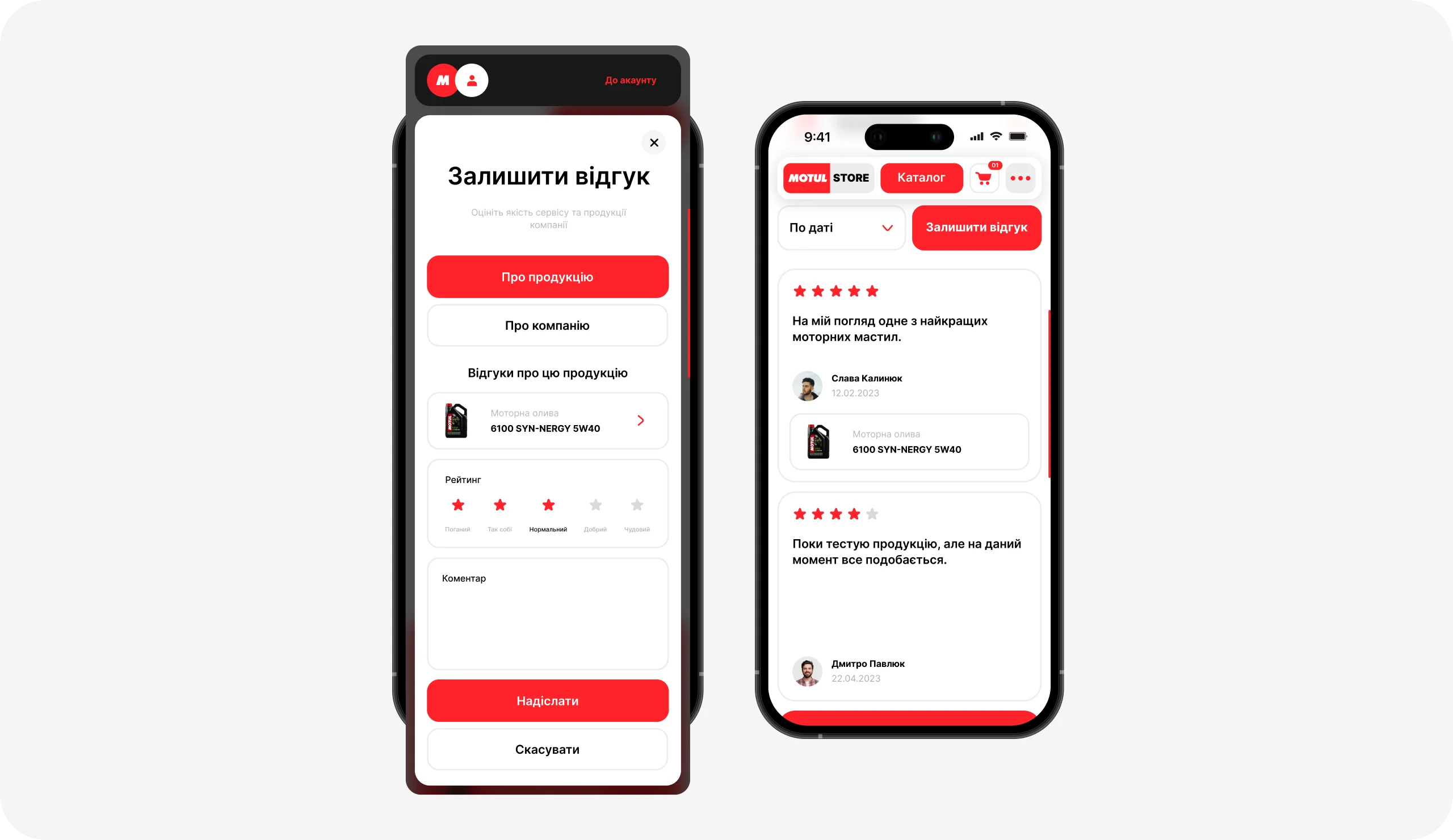
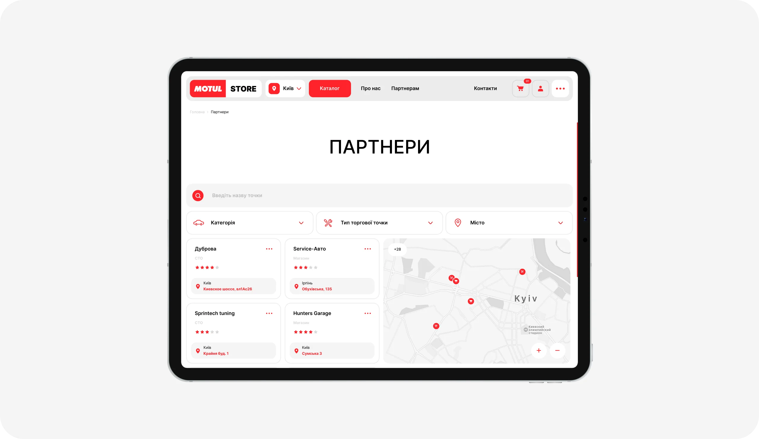
Overview Large E-Commerce website of the world famous brand for vehicle maintenance Motul. Our main task was to think over the logic of the entire website with the possibility of getting acquainted with products and purchases for all age categories, as well as other sections for getting to know the brand.
Corporate Website

Motul
Paris, FranceWebsite in live
Explore

Challenge
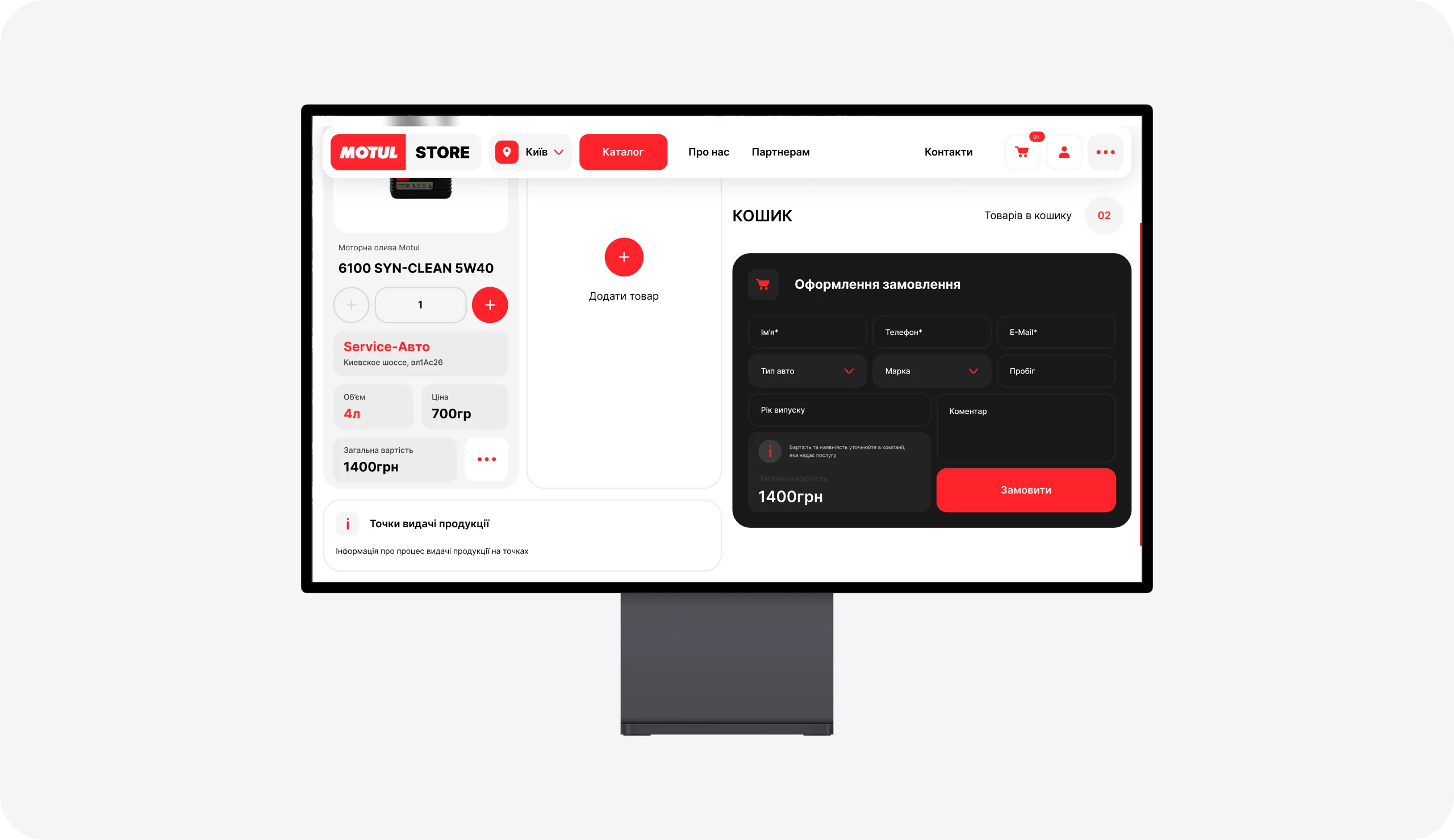
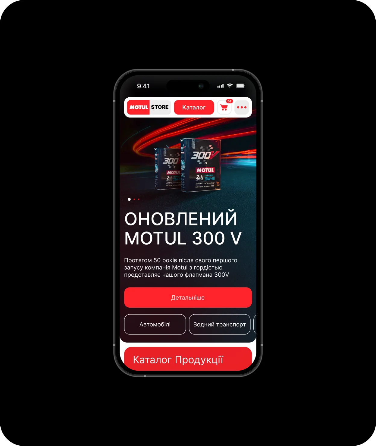
The brand’s problem was an outdated website that reduced sales and, due to inconvenient purchasing functionality, users left the website without completing checkout. Also, the old Bolo website poorly implemented the information content of the products in the catalog, as well as their visual display - and this, as we know, is the most important product that the company sells.
These are just a few of the main aspects that influenced the perception of the brand and the poor sales of productions.
Solution
Using a digital strategy, we identified the target audience, which we focused on when developing the interface, and after releasing the website live, we achieved a 40% increase in sales, as well as positive feedback on the use of the website and a simplified and convenient purchasing process.
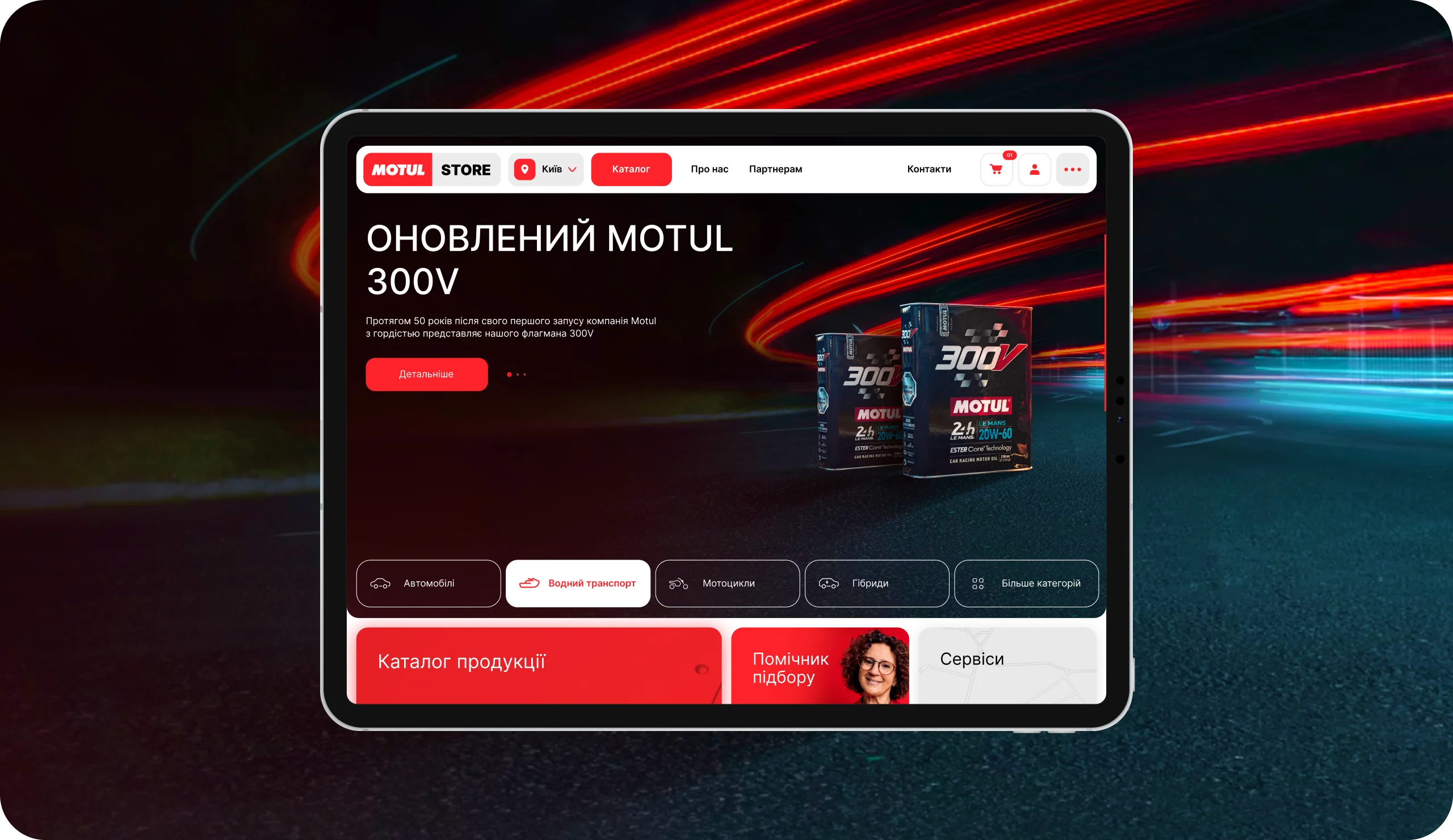
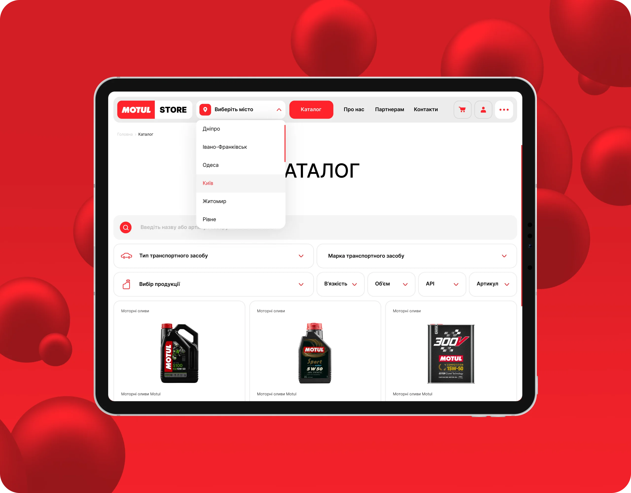
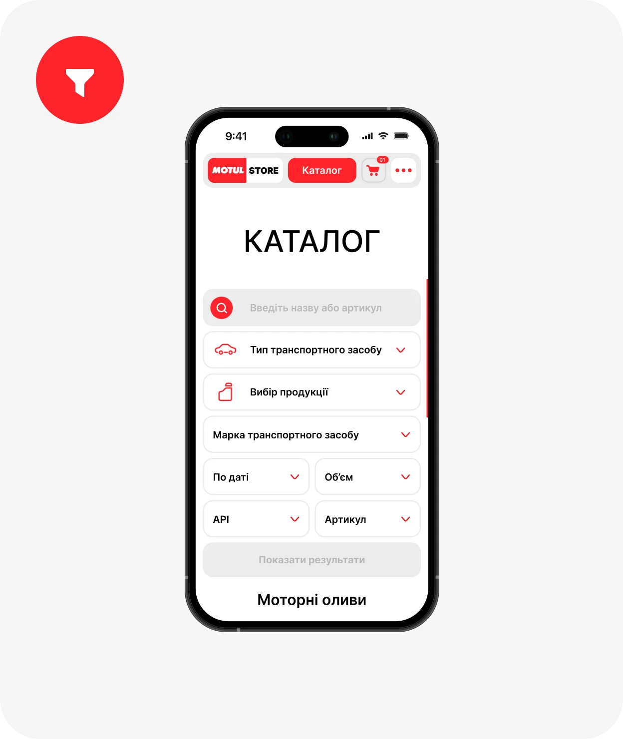
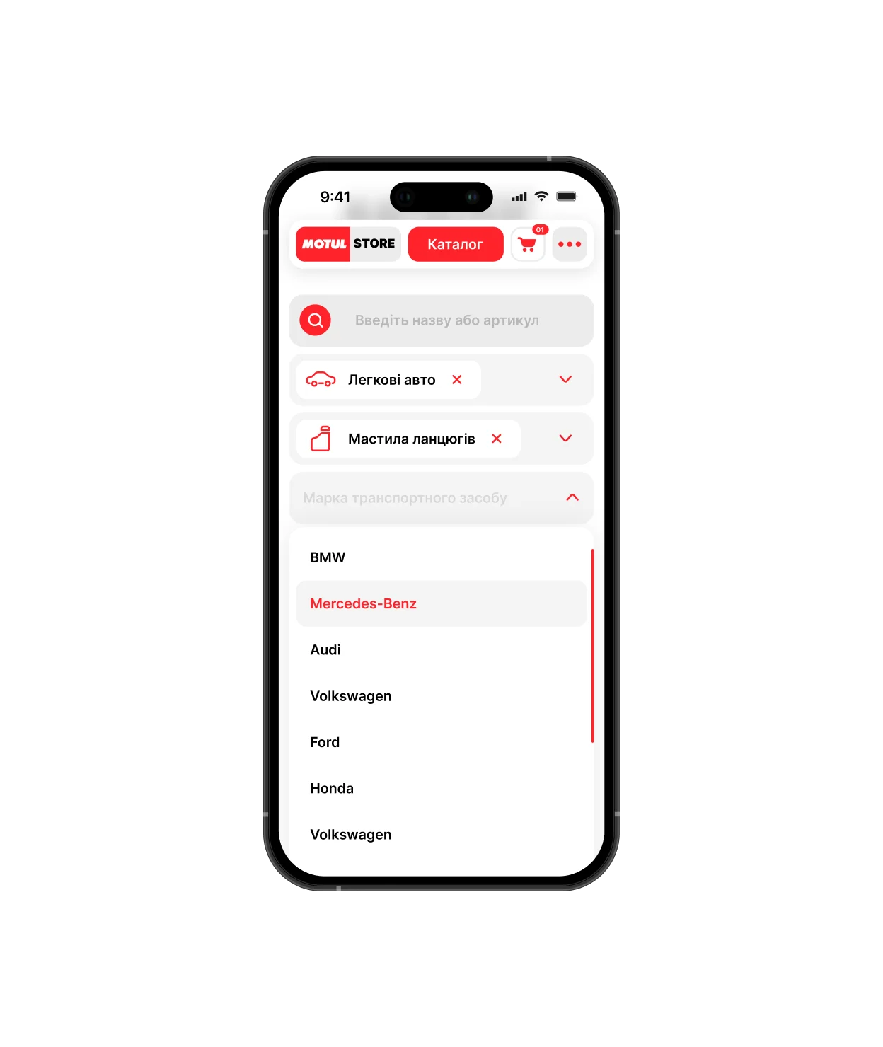
Usability A clear and convenient interface for filtering and familiarizing yourself with brand products for all age-old categories allows you to quickly find the products you need.
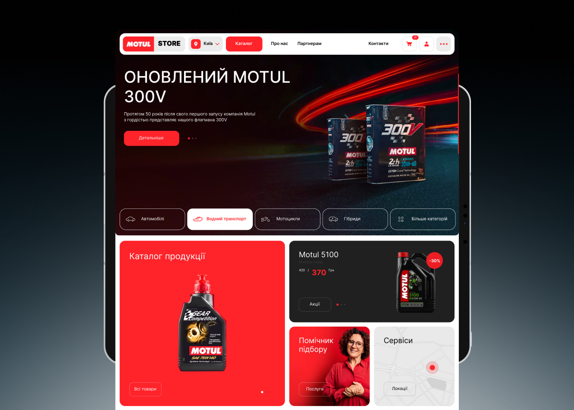
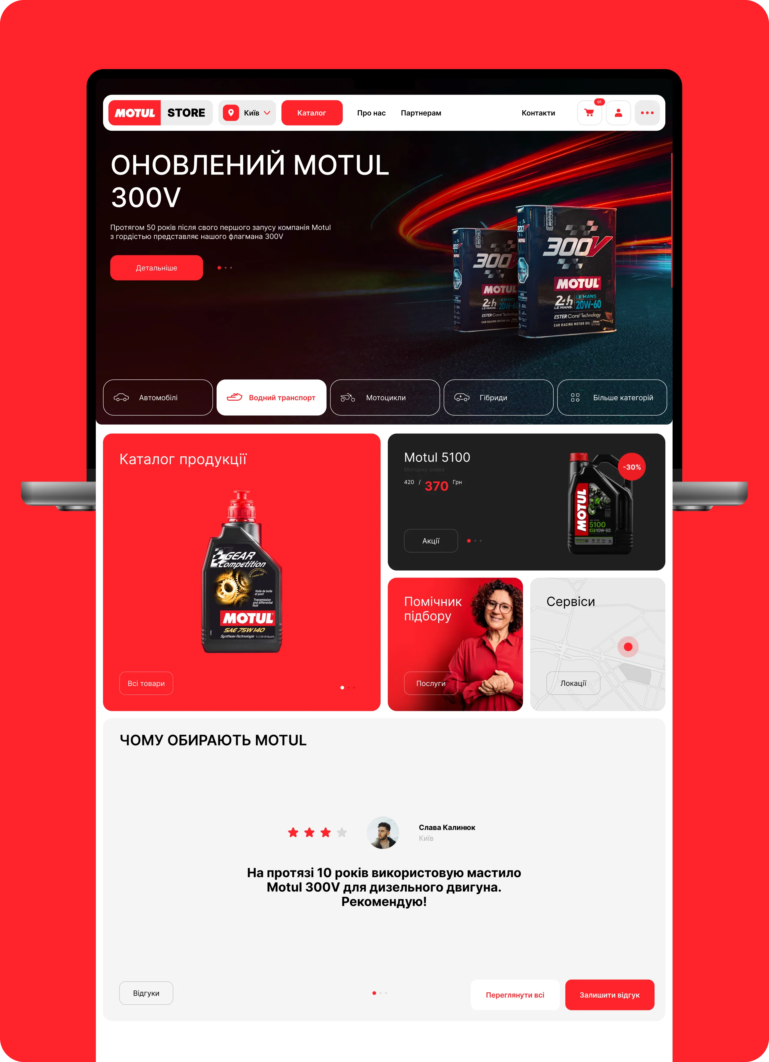
Homepage
Using the heat map of the old website and the digital strategy we developed, we identified the most necessary sections and sections of the website that we implemented on Homepage. This helped give customers the functionality and information that they needed in the first place.
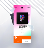
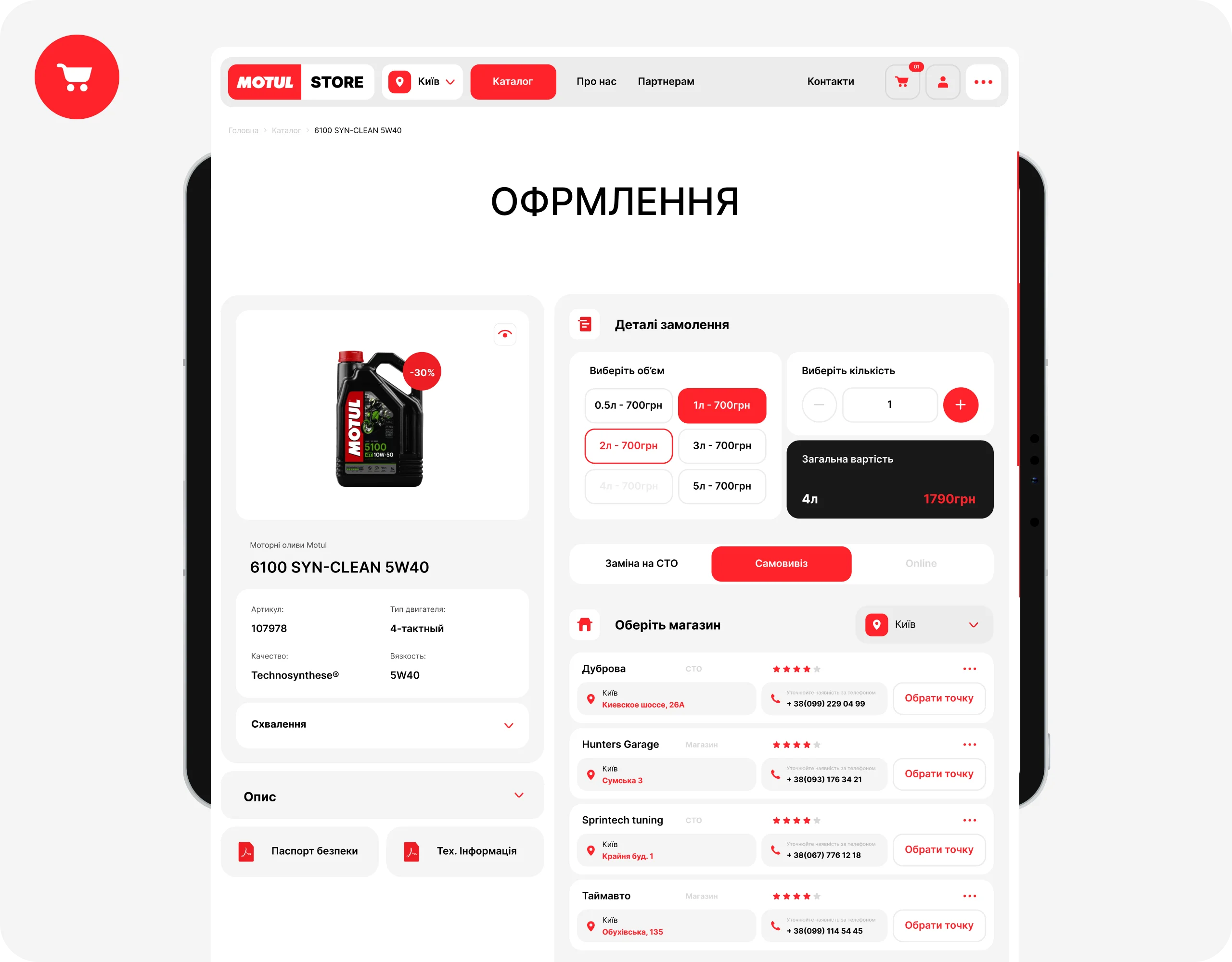
Checkout Automatic generation of the nearest events with brief information and posters allows users to easily select the nearest event and buy a ticket for it
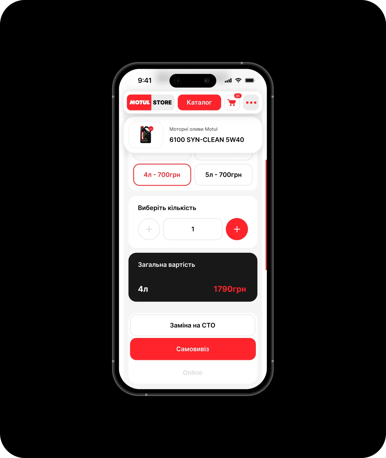
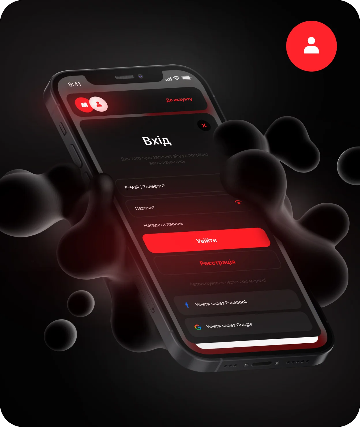
Approach In developing the site, we used the most effective approaches and marketing strategies for the target audience of the product and, based on this data, developed individual functionality and design
Experience
We have a lot of experience working in the music industry and with artists, so we know all the effective approaches for implementing any functionality, increasing the user audience, listening and purchasing releases
Full Case Study

Driving Results
Driving Results
1 - 4
Check out the incredible full case study on Behance
Check out the incredible full case study on Behance
Our cases on the site contain only basic information about working on products, so you can get acquainted in more detail with our approaches and their implementation in full cases on Behance.
Behance Cases
More Cases — More Cases —
More Cases — More Cases —
More Cases — More Cases —
More Cases — More Cases —
More Cases — More Cases —
More Cases — More Cases —
More Cases — More Cases —
More Cases — More Cases —
1 - 6


