


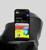


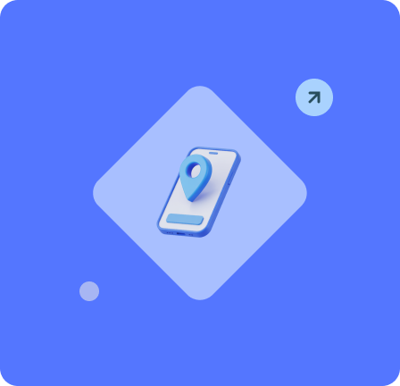
Responsive


Web Design
Service


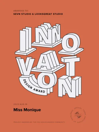
+100
Awards won for our digital product designs for our clients
+30


+10
Years on the market
Responsive Web Design Service
Responsive Web Design Service in today’s digital world, responsive web design is not just a trend — it’s a necessity. Most users now visit websites from mobile devices, and without a fully adaptive layout, businesses risk losing valuable customers. Our agency has over 8 years of experience delivering cutting-edge responsive web design service, with more than 300 projects completed for eCommerce brands, SaaS platforms, and corporate portals — each optimized for flawless performance across all screens.
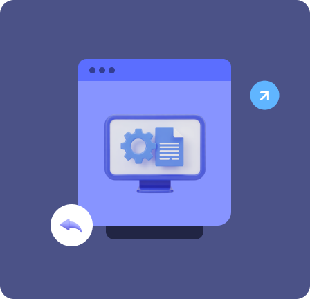
What Responsive Web Design Services Do We Offer?
Full-Spectrum Web Development
As a professional responsive web design company, we provide a full range of responsive web design services that help businesses deliver seamless digital experiences on any device. Our focus is on usability, performance, and design consistency to ensure every visitor enjoys a smooth interaction with your brand.
Let’s chatMobile-First Design Approach
We start every project with a mobile-first strategy — designing for smartphones and tablets before scaling up to larger screens. This method ensures fast loading, intuitive navigation, and higher conversion rates, as most users begin their journey on mobile devices.
Design adapter for mobile devices
Responsive UI/UX Design
Our team creates adaptive user interfaces that adjust to any screen resolution or orientation. The result is a visually cohesive and easy-to-navigate experience that keeps visitors engaged and encourages them to explore more of your site.

Way to boost sales
Page Load Speed Optimization
We optimize code, compress media, and streamline performance to achieve lightning-fast load times. A fast website reduces bounce rates, improves user satisfaction, and increases the likelihood of turning visitors into customers.

Convenience & engagement
Cross-Screen and Cross-Browser Testing
To guarantee flawless performance, we test every design across multiple devices, operating systems, and browsers. This approach eliminates display inconsistencies and ensures your brand looks perfect everywhere.

Way to boost sales
Mobile SEO Optimization
Our experts implement SEO best practices tailored for mobile users. From responsive metadata and structured content to optimized page speed, we help your website rank higher in search results and attract more organic traffic.
Convenience & engagement
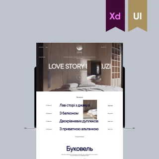
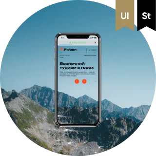
Shpyci
Website
Ukraine
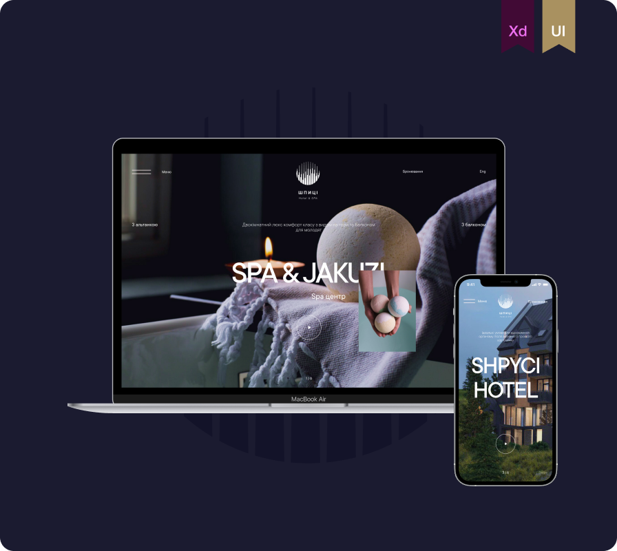
Case study
Website for a Spa hotel in the ski resort Bukovel located in Eastern Europe with a focus on high quality services and attention to detail in architecture.
Services
Front-End
Back-End
UX Strategy
UI/UX
Feedback

“We needed a stylish and user-friendly website that would reflect the relaxing atmosphere of our hotel and attract new guests. The team delivered a beautiful, modern design and intuitive interface that truly captured our brand. The result exceeded expectations and continues to bring in positive feedback and bookings.”
Show more reviews on Clutch
 Show case study
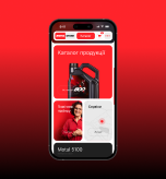
Motul
E-Commerce
France
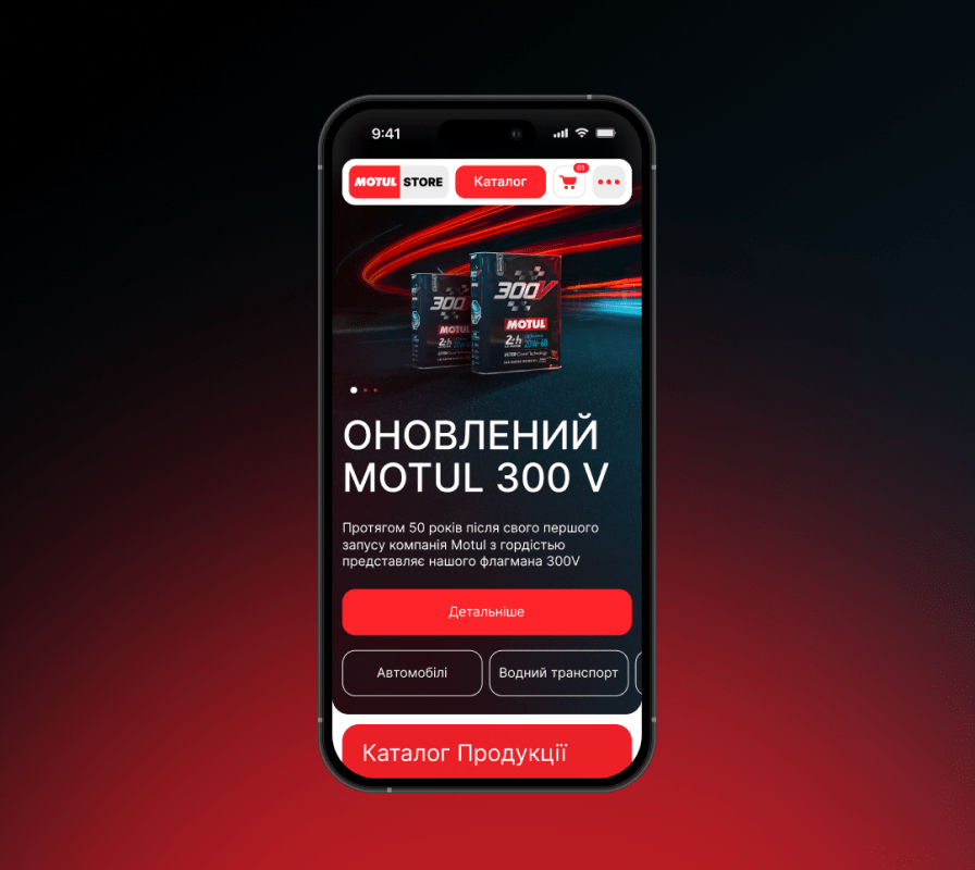
Case study
Large e-commerce website gets 60% increase in sales after launch. Follow the journey from an outdated website that dropped down sales because of its horrible checkout process to a tailor-made design meant to boost sales.
Technologies
Front-End
HTML5
ReactJS
NodeJS
Back-End
QA
SEO Optimization
Feedback

“ The site exceeded the client’s expectations, and sales on it have increased by 50%, even without promotion. Their commitment to the project was key to the engagement’s success.”
Show more reviews on Clutch
Show case study
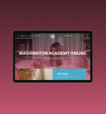
Washington Academy
Corporate website
USA
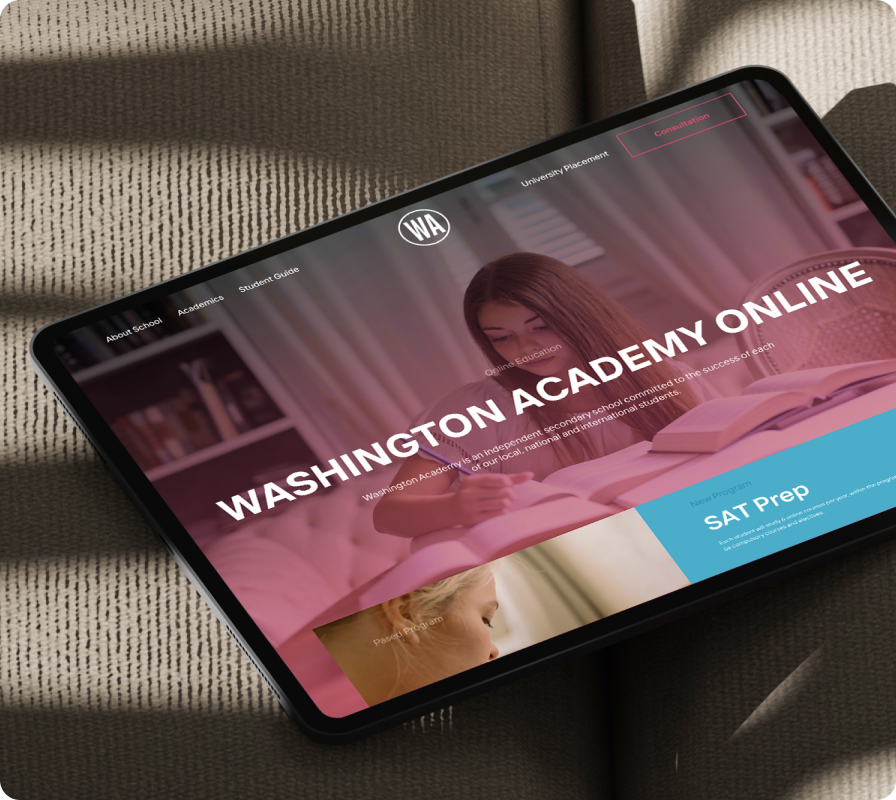
Case study
We developed a website for the American academy WASHINGTON ACADEMY, implementing convenient functionality for introducing branches and learning opportunities with a focus on online education.
Technologies
Market research
Brand research
Branding
Brand book
Feedback

“What I liked most was how the LOOKSGREAT team visually conveyed the industry of our work in the logo. This conveys the field of our work very well for users who see our brand for the first time.”
Show more reviews on Clutch
Show case study
See all our cases
Explore success business stories
LET’S TALK / LET’S TALK-
LET’S TALK / LET’S TALK-
LET’S TALK / LET’S TALK-
LET’S TALK / LET’S TALK-
LET’S TALK / LET’S TALK-
LET’S TALK / LET’S TALK-
LET’S TALK / LET’S TALK-
LET’S TALK / LET’S TALK-
Solutions From Our Responsive Website Design Company
How we handle responsive web products
Looksgreat, a responsive website design company, builds adaptive corporate sites, eCommerce stores, SaaS platforms, and landing pages that perform flawlessly on any device, delivering visually appealing websites that drive measurable business results.

Responsive Corporate Websites (e.g., financial companies, educational projects, tech startups)
We design responsive corporate websites that showcase your brand, engage users, and adapt seamlessly to any device, helping businesses in finance, education, and tech achieve their goals.

Online Stores
For online retailers, we create responsive eCommerce websites optimized for conversions and speed. Each product page, checkout form, and navigation element is crafted to perform perfectly across all devices. This ensures smooth shopping experiences that boost sales and reduce cart abandonment.

SaaS Platforms
Our team develops responsive SaaS platforms with intuitive interfaces and scalable architecture. We focus on clarity, usability, and accessibility — so both desktop and mobile users can easily interact with data and manage their accounts. These solutions empower technology startups and enterprise-level companies to deliver consistent value online.

Landing Pages for Marketing Campaigns
We design conversion-focused landing pages for advertising and marketing campaigns. Built with a mobile-first mindset, these pages load fast, capture attention instantly, and guide visitors toward specific actions — from filling out a form to making a purchase.
Features of Responsive Website Development
Our Responsive Website Design Process
Lets talkOur responsive website development company creates fast, reliable sites that adapt to any device, featuring mobile-first design, smooth navigation, CMS integration, and high performance for an exceptional user experience.

Mobile-First Approach
01Designs are created for smartphones first, ensuring intuitive layouts and higher user engagement on the devices most visitors use.

Automatic Adaptation to Any Screen
02Websites automatically adjust to any screen size, providing a consistent visual experience.
Easy Navigation on Smartphones
03Menus, buttons, and interactive elements are optimized for touch screens, making browsing effortless.
Integration with Modern CMS
04Compatible with leading content management systems for easy updates and efficient management.
High Performance Even on Mobile Networks
05Maintains fast load times and smooth functionality even on slower connections.
Technologies We Use for Responsive Web Design
Here are the key tools and frameworks we use for responsive website design. Building fully adaptive, high-performance sites requires clean code, scalable architecture, and seamless functionality across desktops, tablets, and smartphones — ensuring speed, usability, and reliability.
HTML5
Provides a semantic, structured foundation for all web content, enabling search engines to better understand your site and ensuring compatibility across all browsers and devices. Its modern elements also make complex layouts simpler to maintain and scale.
HTML5
CSS3
Allows us to create responsive, flexible designs with animations, transitions, and advanced styling. This ensures your website looks polished and professional while adapting seamlessly to any screen size.
CSS3
Bootstrap
A powerful framework that speeds up development by offering pre-built responsive components. It ensures visual consistency across devices, reduces development time, and allows rapid prototyping of new features.
Bootstrap
Tailwind
A utility-first framework that gives us full control over design without heavy custom code. It enables faster styling of complex interfaces, making websites highly customizable while maintaining responsive behavior.
Tailwind
React
A JavaScript library for building dynamic, interactive user interfaces. React helps create smooth, fast-loading websites where components update in real time, improving user engagement and experience.
React
Next.js
Extends React with server-side rendering and static site generation, providing faster load times, improved SEO, and scalable architecture. This ensures your website performs flawlessly even under high traffic.
Next.js
Process of Responsive Web Design Development
How We Handle Responsive Website Development
At our responsive web design company, we follow a structured process to create websites that are visually engaging, fast, and fully adaptive across all devices. Every step is designed to ensure your website delivers the best user experience while supporting your business goals.

Audit of the Existing Website and Target Audience Analysis
We begin by reviewing your existing website (if any) and analyzing your target audience. This helps us identify opportunities for improvement, understand user behavior, and define clear objectives for the responsive redesign.

Prototype Creation Using a Mobile-First Approach
Next, we create detailed prototypes with a mobile-first approach. Designing for smartphones and tablets first ensures intuitive layouts, easy navigation, and a smooth user experience from the smallest screens to desktops.

Development of a Responsive Design
Our team develops the responsive design, focusing on consistent visuals, scalable layouts, and usability across all devices. Every element is crafted to adjust automatically to different screen sizes.

Testing Across Various Devices and Screen Sizes
We rigorously test the website on multiple devices, screen resolutions, and browsers to guarantee flawless performance. This ensures that your visitors always enjoy a seamless experience.

Page Speed Optimization
Before launch, we optimize page speed, compress assets, and fine-tune code. Fast loading times reduce bounce rates, improve engagement, and enhance overall user satisfaction.

Project Launch
Finally, the responsive website is launched, fully functional, and ready to deliver a superior experience to your audience. Our responsive web design company ensures that every project is adaptive, high-performing, and ready to grow with your business.
Our clients on working with Looksgreat agency
Ihor Bauman
Founder Workee, Sf California

As of today we see the much higher conversion to trials and higher engagement on the website. Our cost of new trial is decreased by 40% if comparing with the previous version.
Founder Workee, Sf California


Show more reviews on Clutch
LET’S TALK / LET’S TALK-
LET’S TALK / LET’S TALK-
LET’S TALK / LET’S TALK-
LET’S TALK / LET’S TALK-
LET’S TALK / LET’S TALK-
LET’S TALK / LET’S TALK-
LET’S TALK / LET’S TALK-
LET’S TALK / LET’S TALK-
Benefits of Our Responsive Web Design Company
Why work with us
Let’s work together!We create websites that do their job — whether it’s engaging users, presenting products or services, or serving as an additional sales channel. Websites built by our responsive web design company come with clean, modern aesthetics, adaptive layouts, and smooth performance on all devices.
01
We Increase Conversion Through an Intuitive Mobile UX
Our designs prioritize mobile-first experiences, easy navigation, and interactive elements that guide users naturally toward desired actions. Every solution is tailored to your business needs, ensuring maximum engagement and higher conversion rates.
02
We Improve Website Rankings on Google
We implement SEO best practices, fast-loading pages, and structured content to help your website rank higher in search results. Integrations with analytics, APIs, and other tools ensure your site remains optimized and measurable.
03
We Have Experience Across Various Industries
Our team has delivered responsive websites for eCommerce, SaaS, corporate portals, and more. This cross-industry expertise allows us to adapt design strategies to different audiences and business goals.
04
We Provide Long-Term Support
We offer ongoing maintenance, performance optimization, and updates to keep your website secure, fast, and fully responsive as your business grows.
+60%

Increase in traffic on on client websites
+30

Professional team members with experience in digital products
90%

Of our customers come back with more projects
+60%
Increase in traffic on on client websites
+30
Professional team members with experience in digital products
90%
Of our customers come back with more projects
+2M
New users and visitors on our clients' websites
+60%
Increase in traffic on on client websites
+30
Professional team members with experience in digital products
90%
Of our customers come back with more projects
+2M
New users and visitors on our clients' websites
LET’S MAKE IT GREAT/LET’S MAKE IT GREAT/
LET’S MAKE IT GREAT/LET’S MAKE IT GREAT/
LET’S MAKE IT GREAT/LET’S MAKE IT GREAT/
LET’S MAKE IT GREAT/LET’S MAKE IT GREAT/
LET’S MAKE IT GREAT/LET’S MAKE IT GREAT/
LET’S MAKE IT GREAT/LET’S MAKE IT GREAT/
LET’S MAKE IT GREAT/LET’S MAKE IT GREAT/
LET’S MAKE IT GREAT/LET’S MAKE IT GREAT/
Frequently Asked Questions
Didn’t find an answer to your question? Drop us a line!
Why does my business need a responsive website?
A responsive website ensures your site looks and works perfectly on all devices, improving user experience, engagement, and conversions across mobile, tablet, and desktop.