Online
Academy of USA
Let’s talk
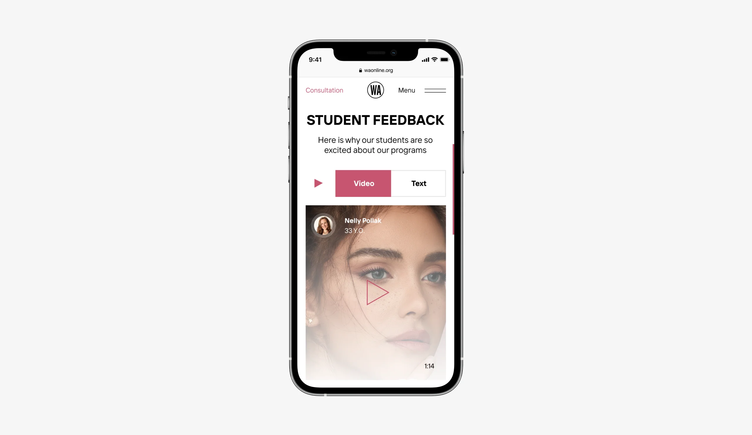
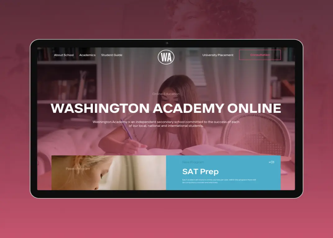
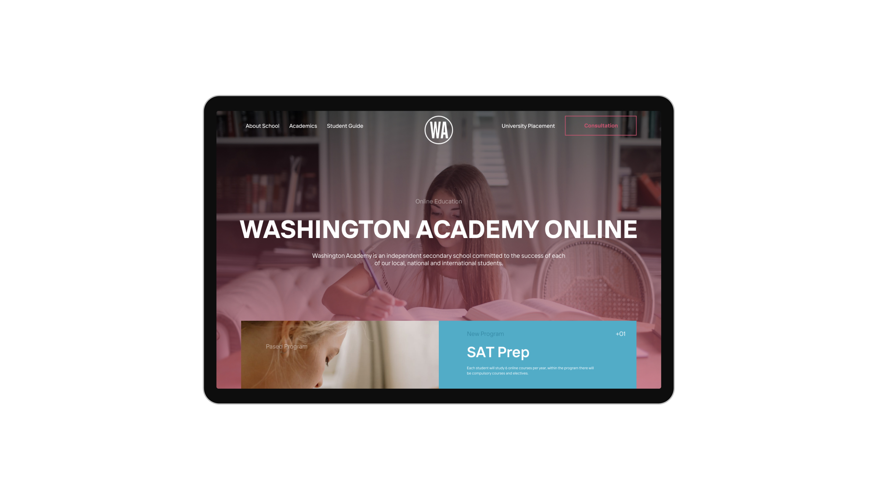
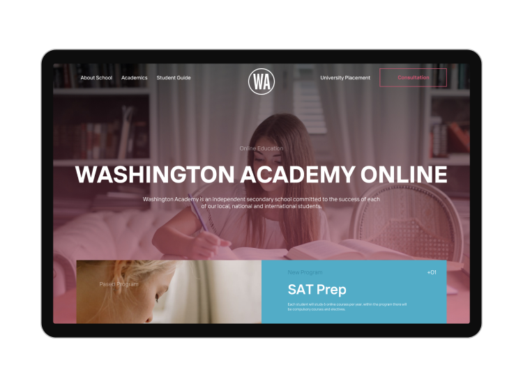
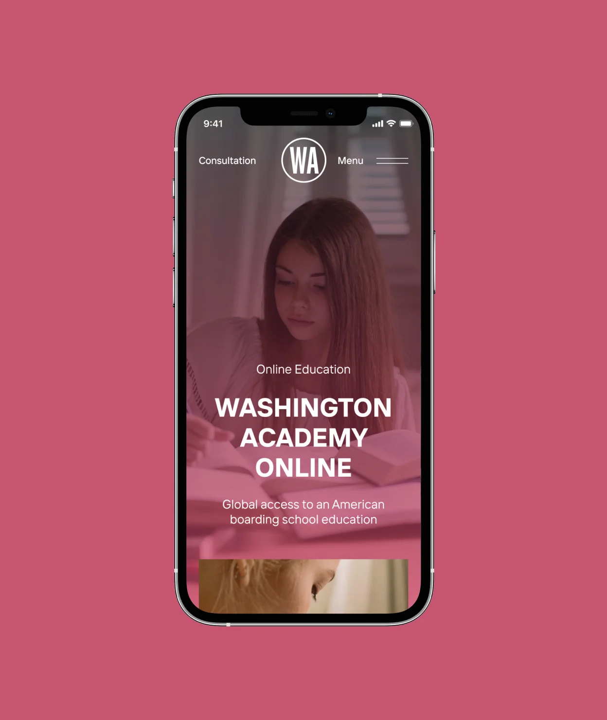
Overview We developed a website for the American academy WASHINGTON ACADEMY, implementing convenient functionality for introducing branches and learning opportunities with a focus on online education.
Corporate Website
Digal strategy
Promo Materials

WASHINGTON ACADEMY
Maine, USAFull Case Study
Explore

Challenge
An important aspect in the website development process was to focus on the target audience of the Academy - parents who chose faculties for their children, and applicants who completed both online training and attending classes at the Academy.
Solution
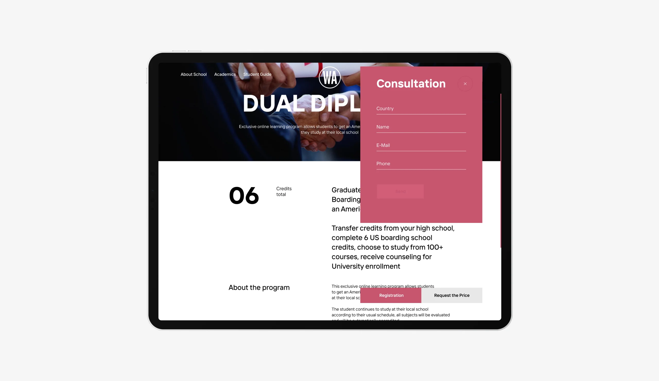
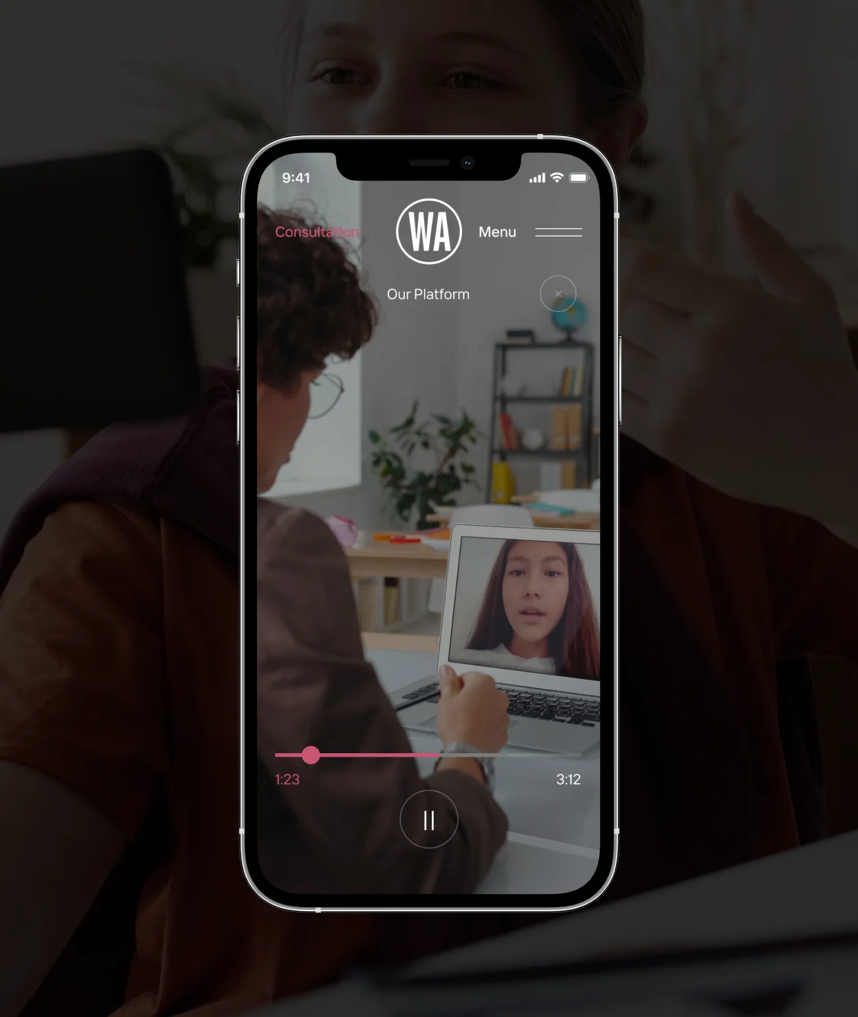
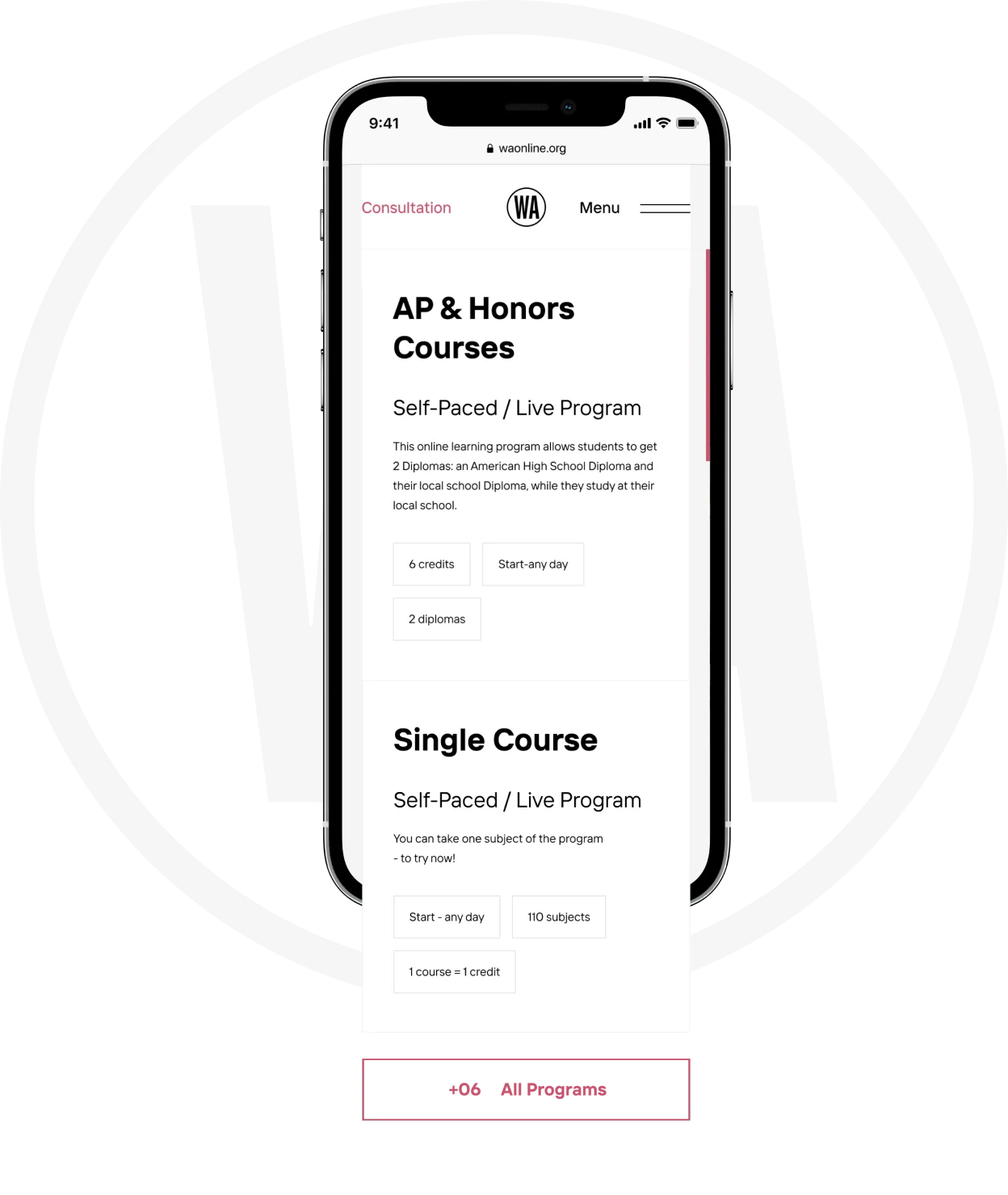
Having identified the target audience, we developed an individual and convenient functionality for familiarization with the academy and subjects for choosing training, after which the applicant could apply for a course to study the subject by simply filling out an online form, which in turn simplified the submission of applications for admission to the academy. Many other sections were also implemented, such as information about the university, a list of teachers, contact information, etc.
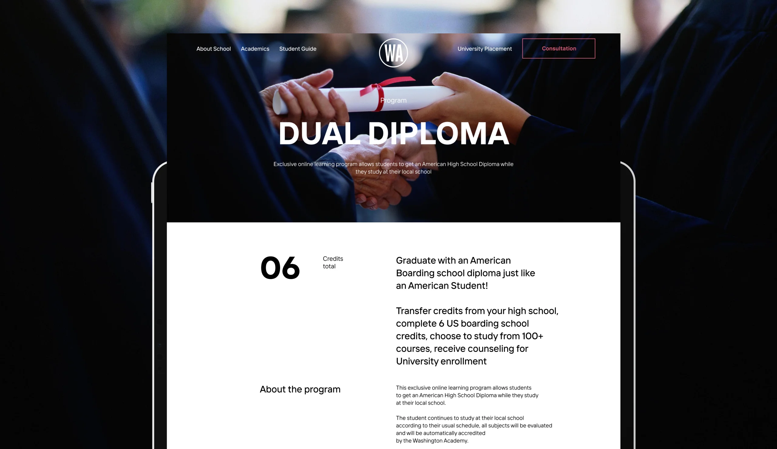
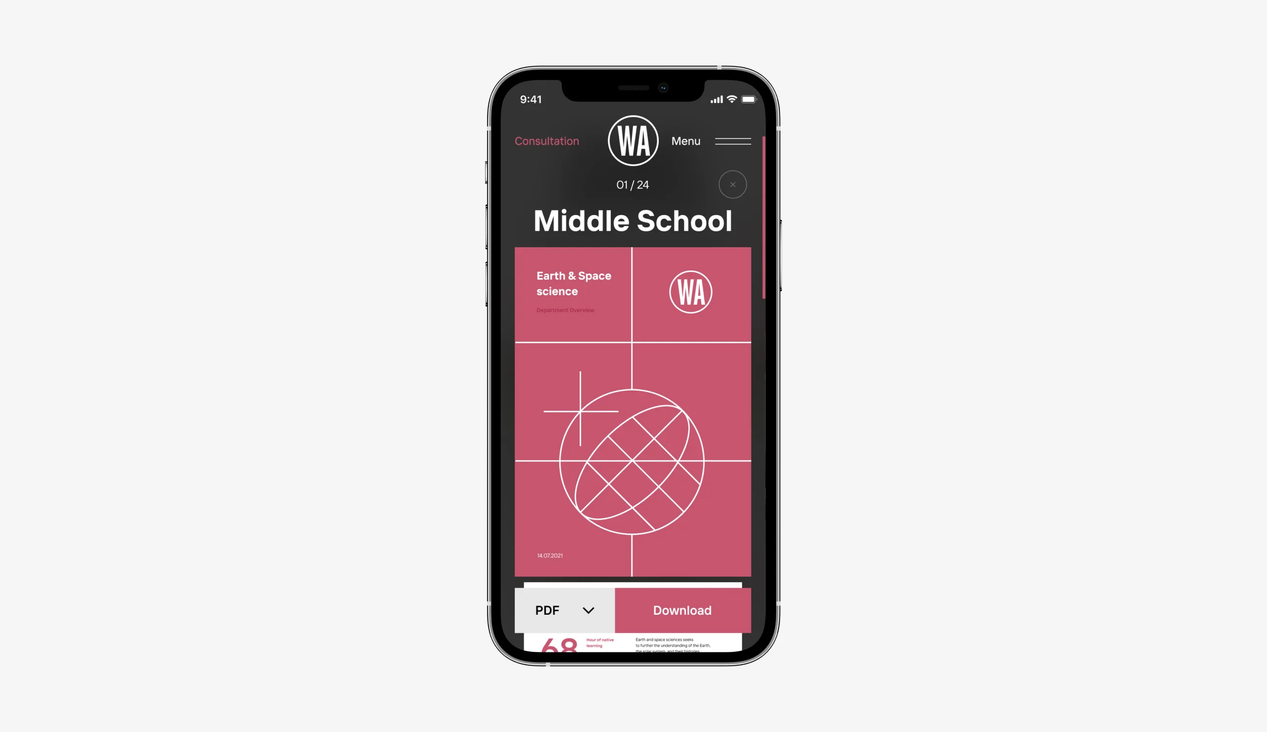
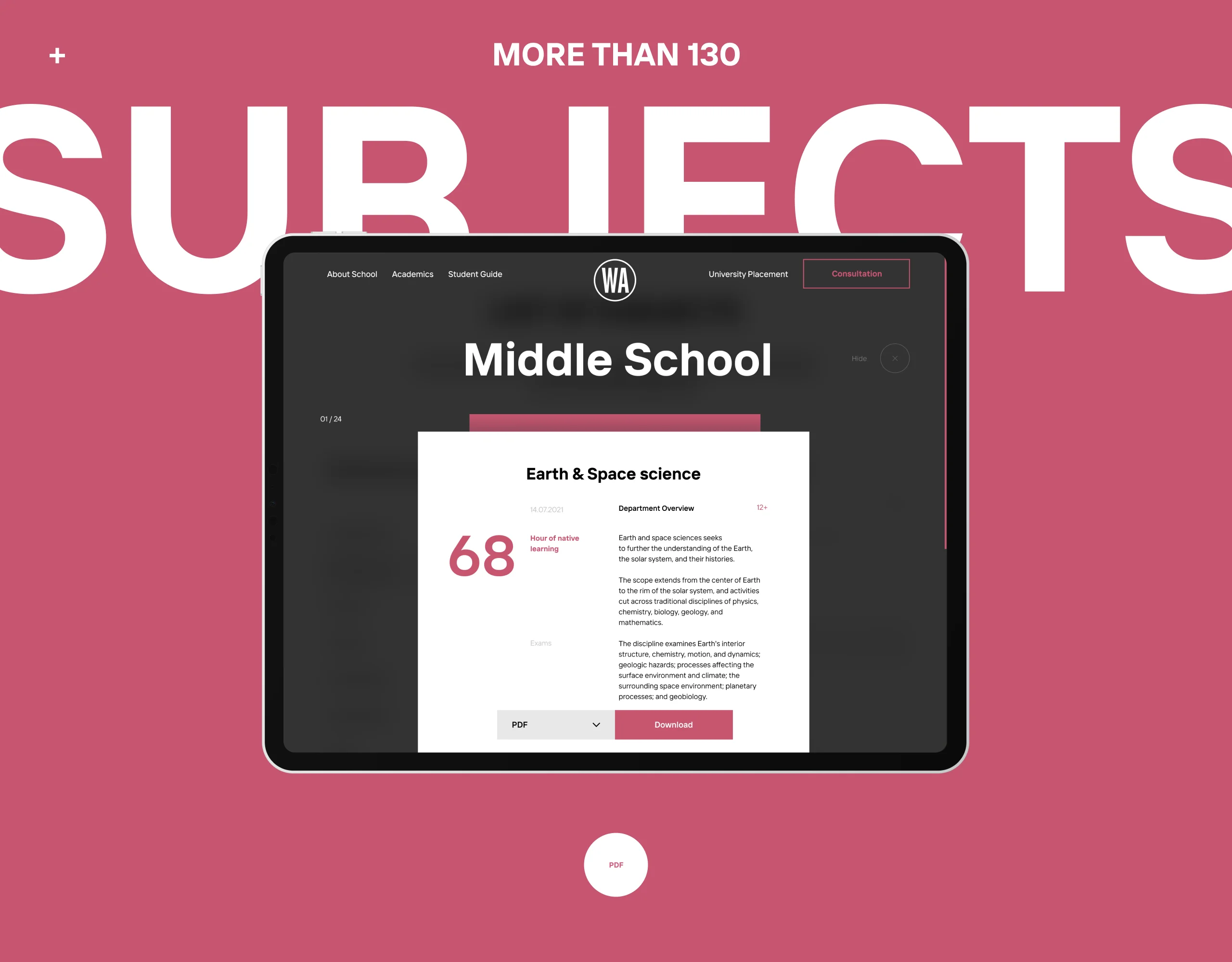
Subjects A convenient and informative implementation of displaying familiarization with complete information about subjects and courses of study with the ability to download a PDF file made it possible to increase traffic to the “Academics” section on the site.
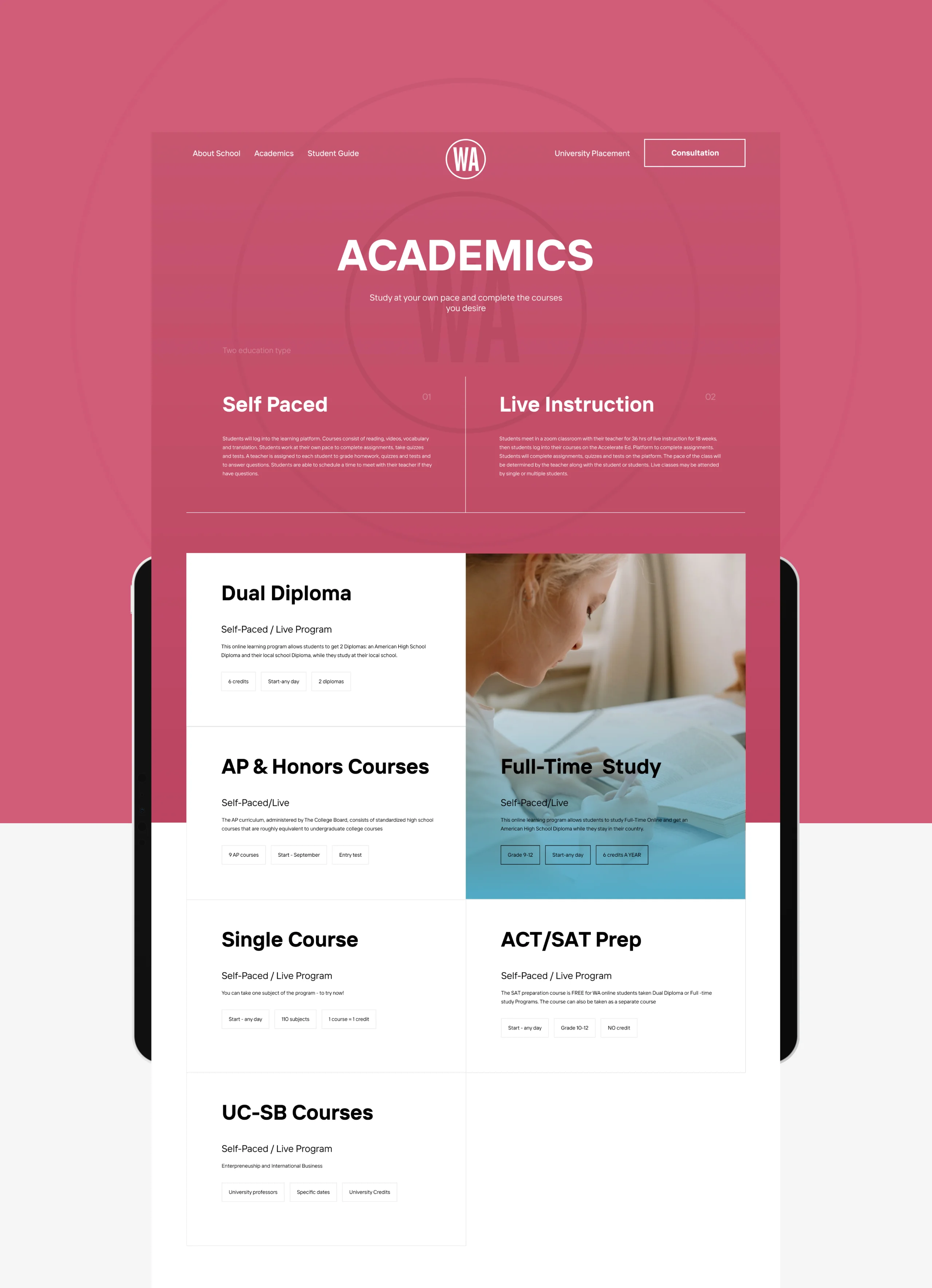
Academics
All courses and academics are implemented with a focus on the necessary information, and the most important of them are highlighted with a background image, which allows the user to focus on the information they need without unnecessary details.
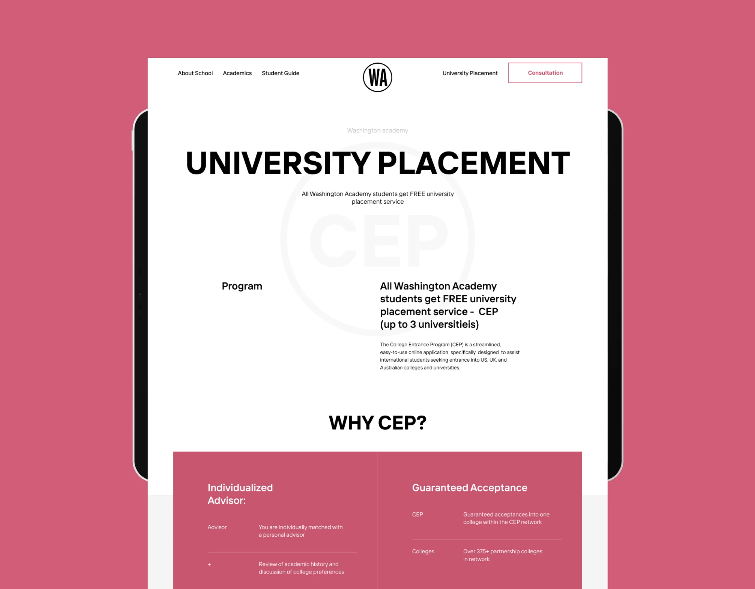
Program An important point in the digital strategy was the very informative implementation of the “University Placement” section of the website, which allowed students to be placed on the academy campus, and the best of them received a free scholarship for training and accommodation.
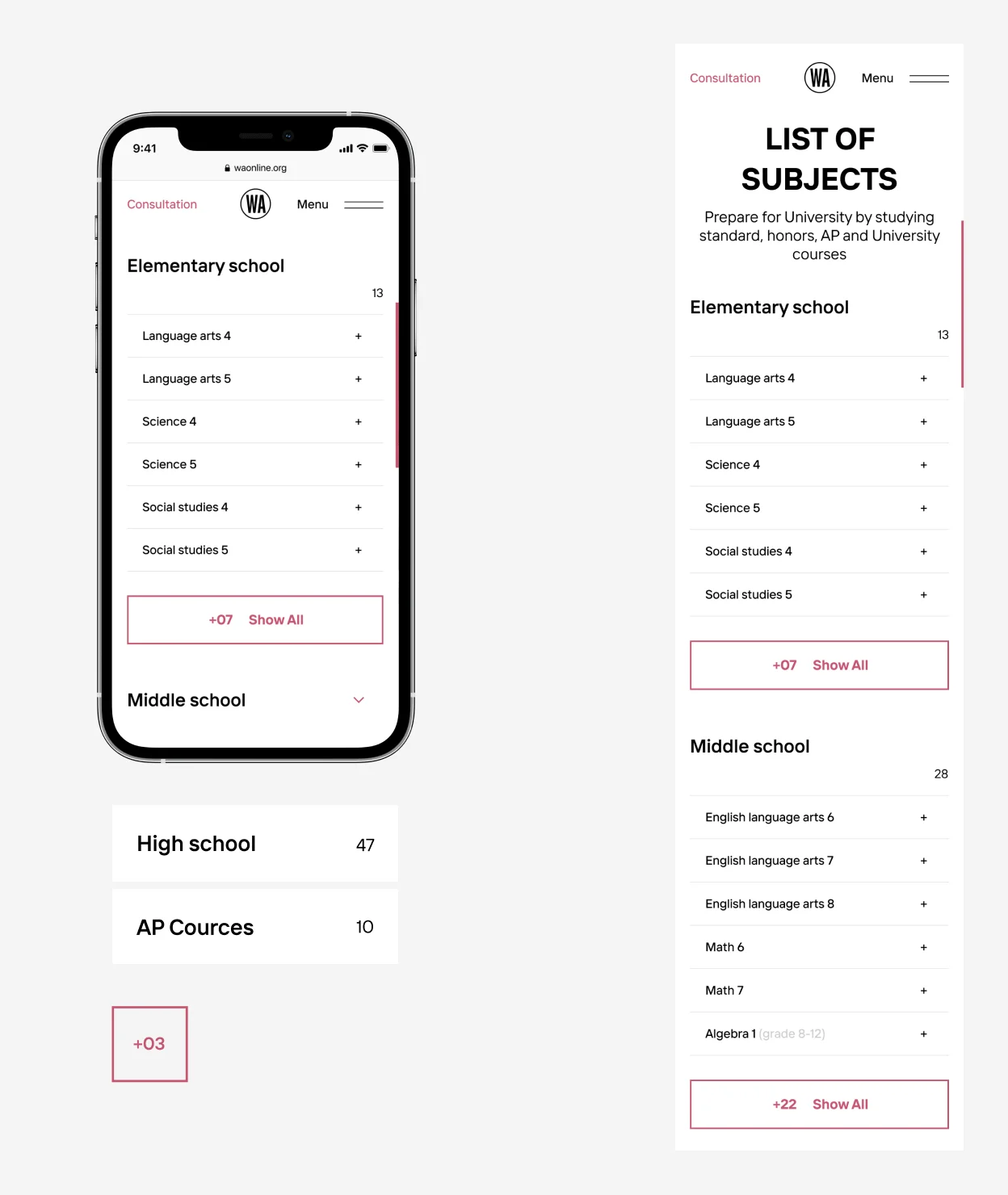
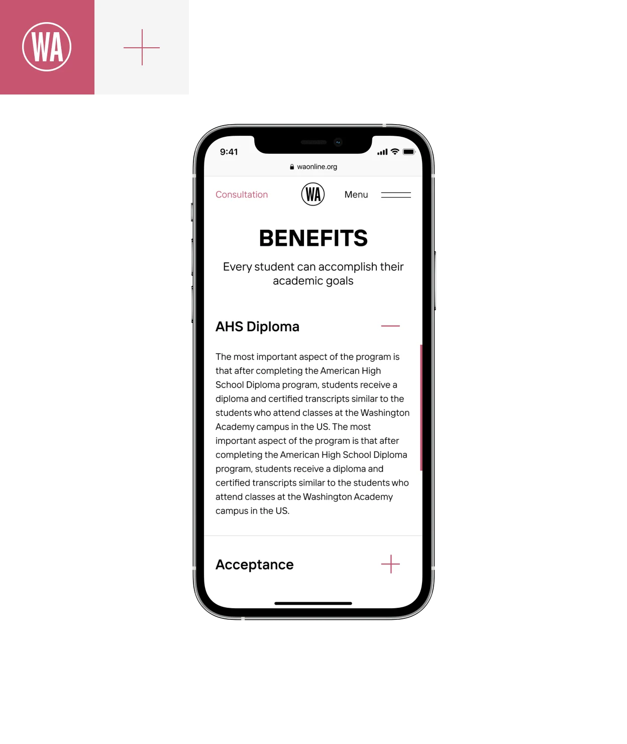
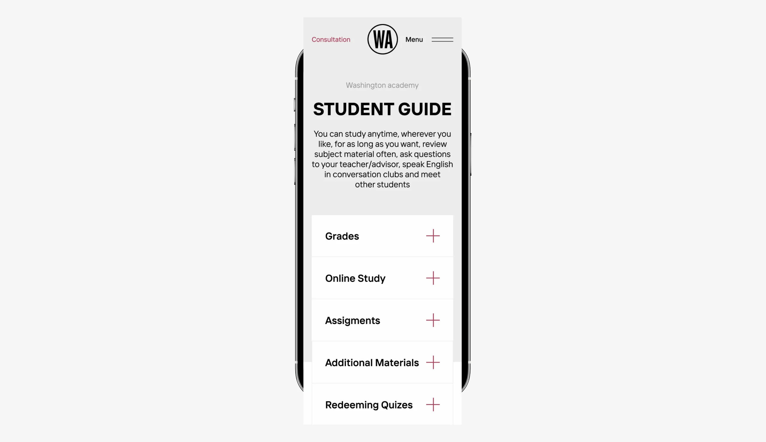
Audience Considering the older audience of website users, parents of applicants who are familiarized with universities before applying, the entire interface should be implemented as clearly as possible, usefull, with well-readable font sizes and navigation elements, so we paid a lot of attention to these aspects.
Experience
We have a lot of experience working with the education and e-learning industry, which allows us to create products that exclusively focus on the needs of customers, highlighting the functionality they need as the main one in the first place, and this approach allows any business in this industry to grow
Full Case Study

Driving Results
Driving Results
1 - 4
Check out the incredible full case study on Behance
Check out the incredible full case study on Behance
Our cases on the site contain only basic information about working on products, so you can get acquainted in more detail with our approaches and their implementation in full cases on Behance.
Behance Cases
More Cases — More Cases —
More Cases — More Cases —
More Cases — More Cases —
More Cases — More Cases —
More Cases — More Cases —
More Cases — More Cases —
More Cases — More Cases —
More Cases — More Cases —
1 - 6


