The first
ticket service in
Ukraine
Let’s talk
Overview The most popular service for buying tickets online for trains, buses and planes in Ukraine with the largest and most active audience of customers.
Brandbook
Brandign
Identity
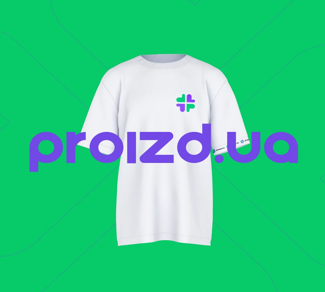
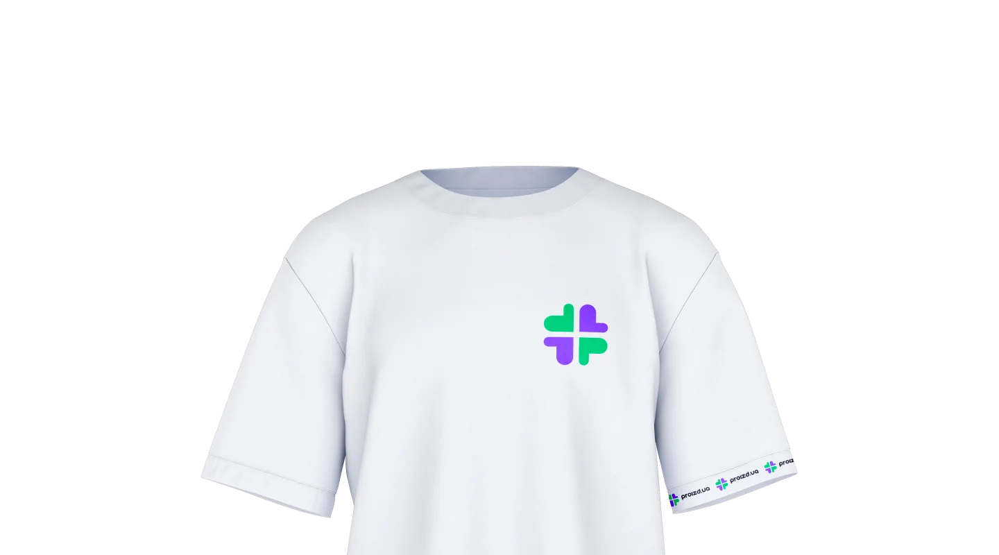
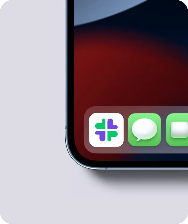
Logotype
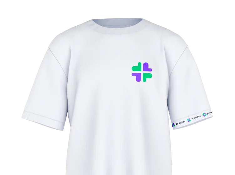
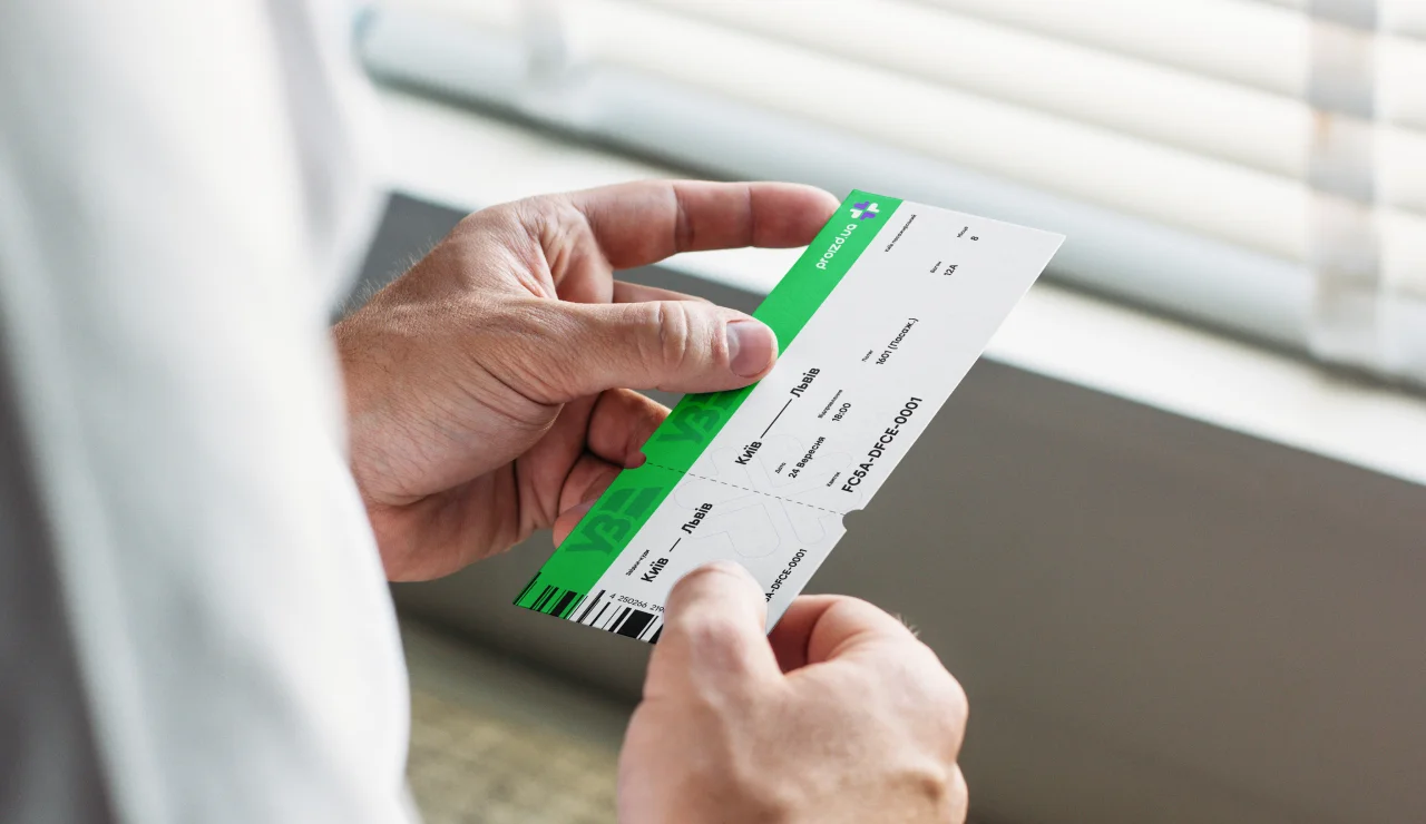
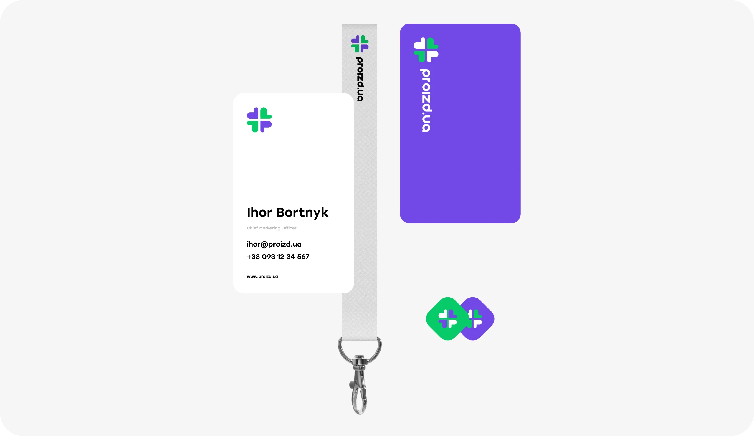
Promo Materials

proizd.ua
Kyiv, UkraineBranding in live
Explore
Challenge
Develop branding for the Ukrainian audience of users that will be able to convey the spirit of Ukrainian ethnicity in a digital approach with the possibility of scaling the brand to European markets in the future.
Solution
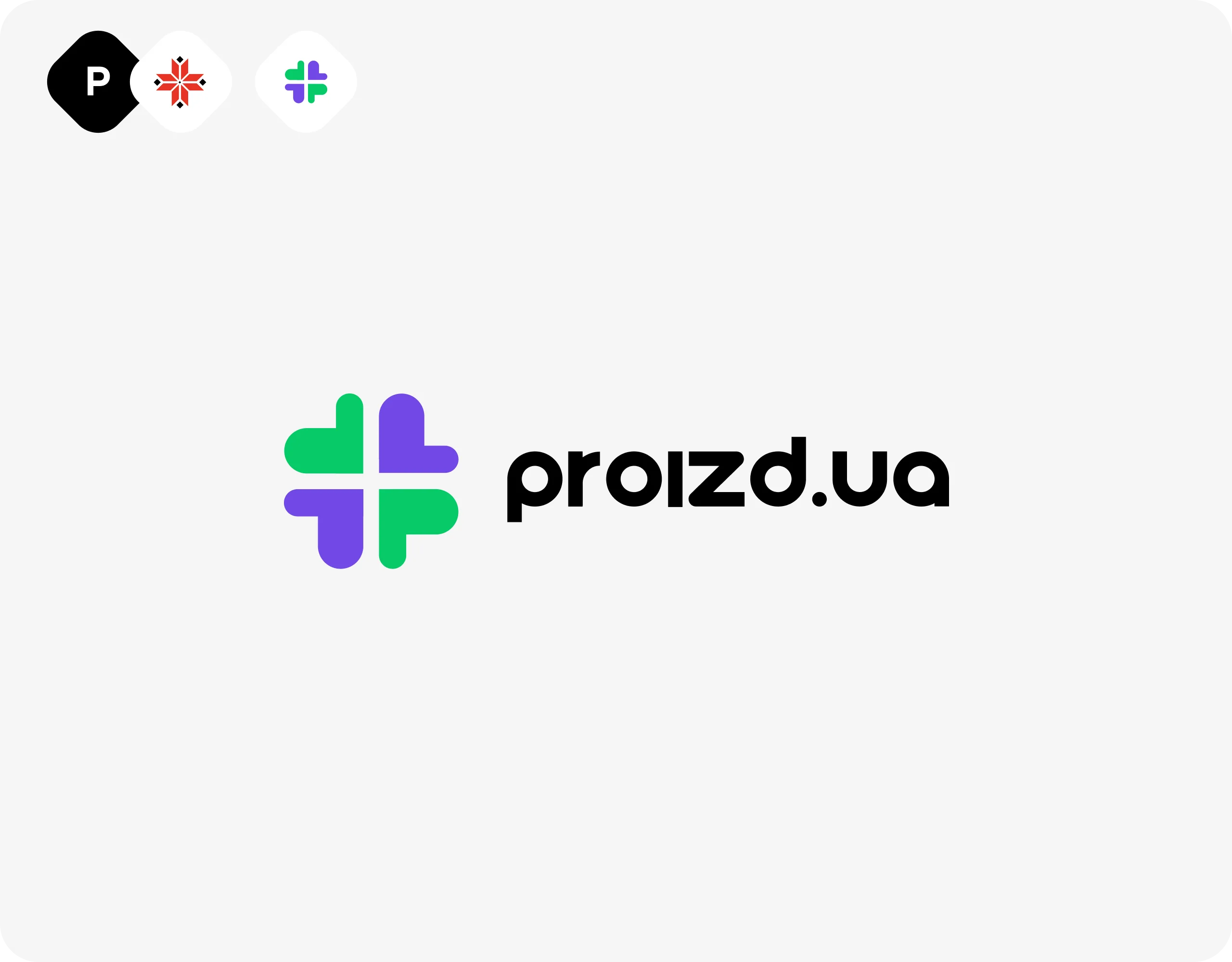
To convey the Ukrainian spirit in the brand, we used traditional elements of Ukrainian ornament, which are very familiar to the Ukrainian audience of users from historical moments and are associated with the traditions and history of the country.
In combination with the first letter of the naming and the spinning rhythm, we realized an individual sign using a digital color palette.

Sign The traditional ethnic element of the Ukrainian ornament, combined with the first letter of the naming and the digital color palette, well conveys the spirit of the digital product with the Ukrainian spirit!
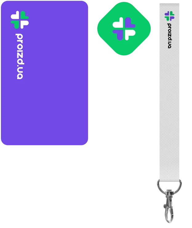
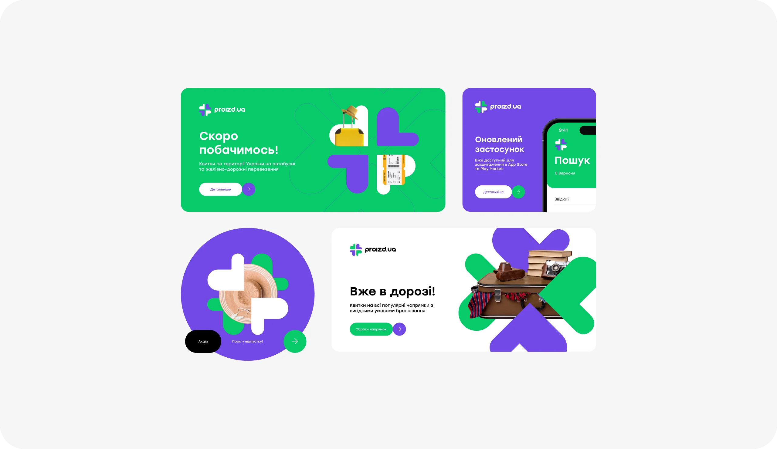
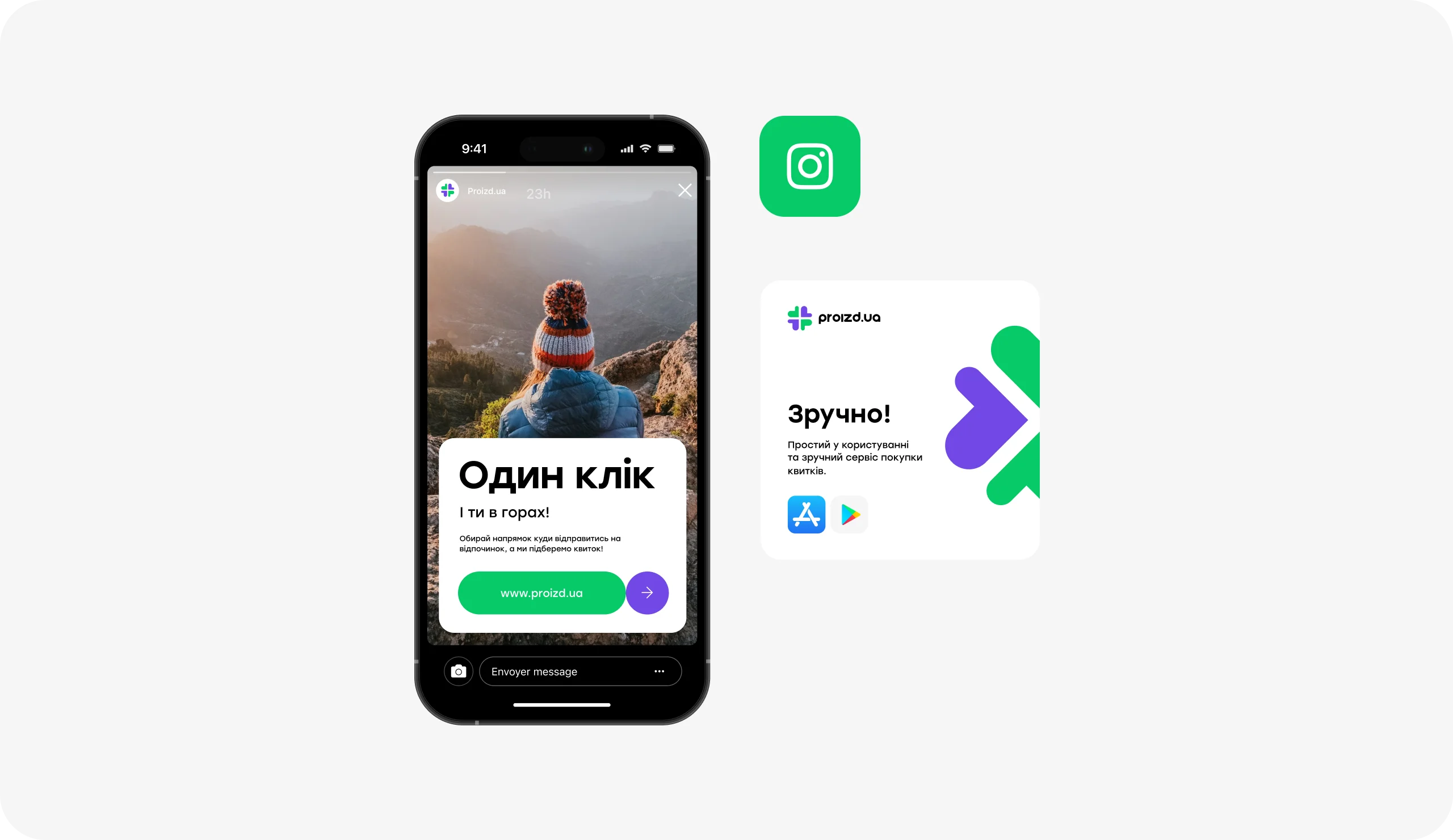
Creatives
Using visual elements of the brand’s activity in combination with the geometric shapes of the logo sign, we were able to create individual visual composition patterns for use of these graphic elements on promotional materials.

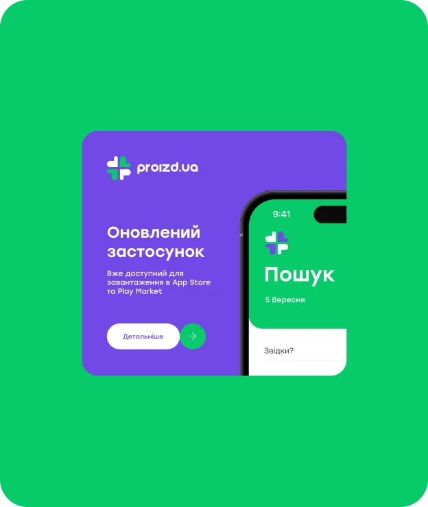

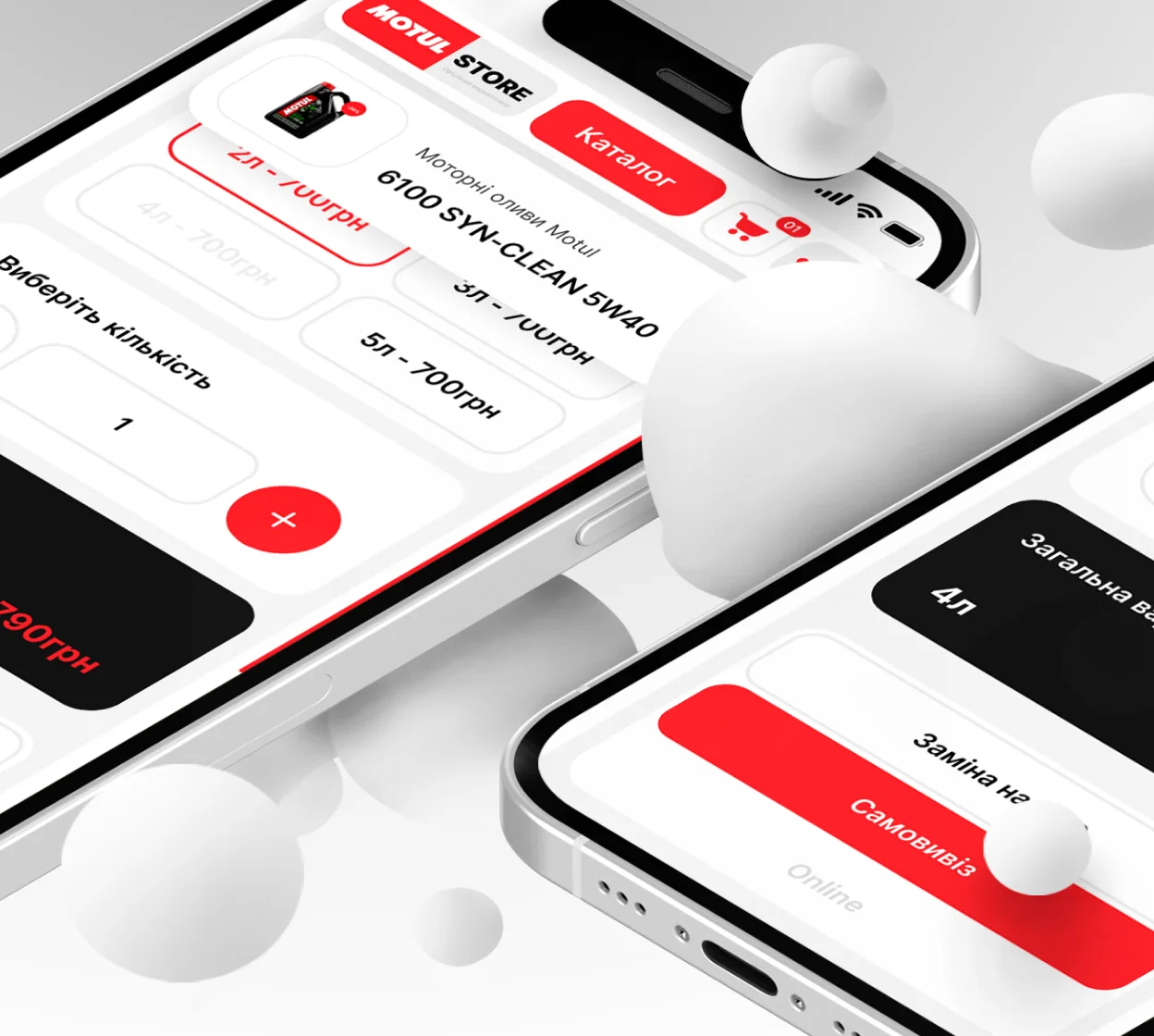
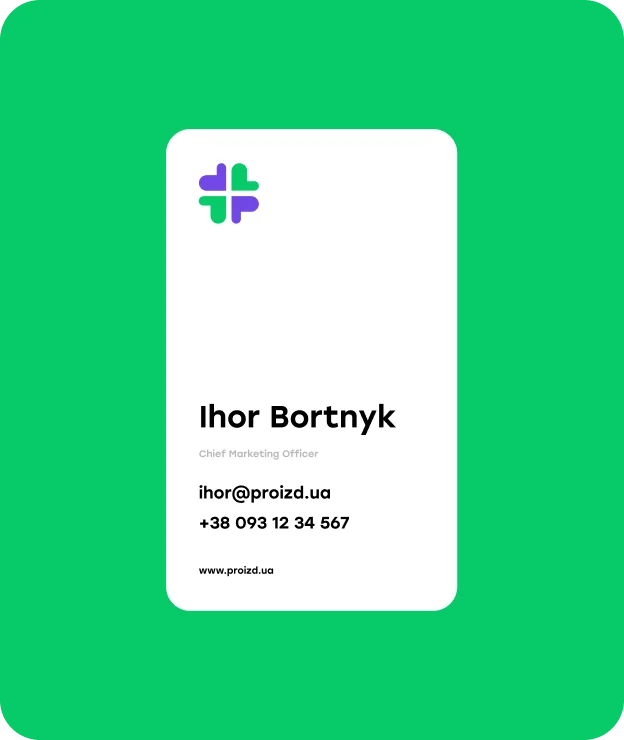
Promo Promotional materials are developed with a clean design approach and an emphasis on the necessary information with the addition of graphics as a secondary element of attention
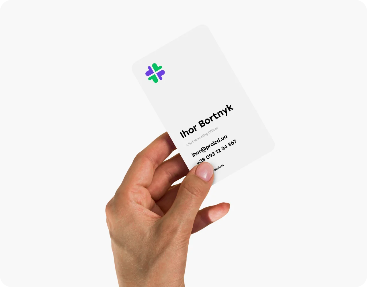

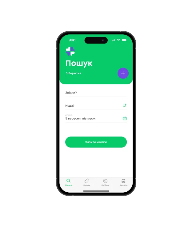
Approach Promotional materials are developed with a clean design approach and an emphasis on the necessary information with the addition of graphics as a secondary element of attention
Experience
Before starting to develop the branding itself, we very well work out the brand strategy and target audience to which the brand wants to direct attention, since the final result (branding) is developed primarily for our customers, and we, as professionals, must give customers what they want.
Let’s talk

Driving Results
Driving Results
1 - 4
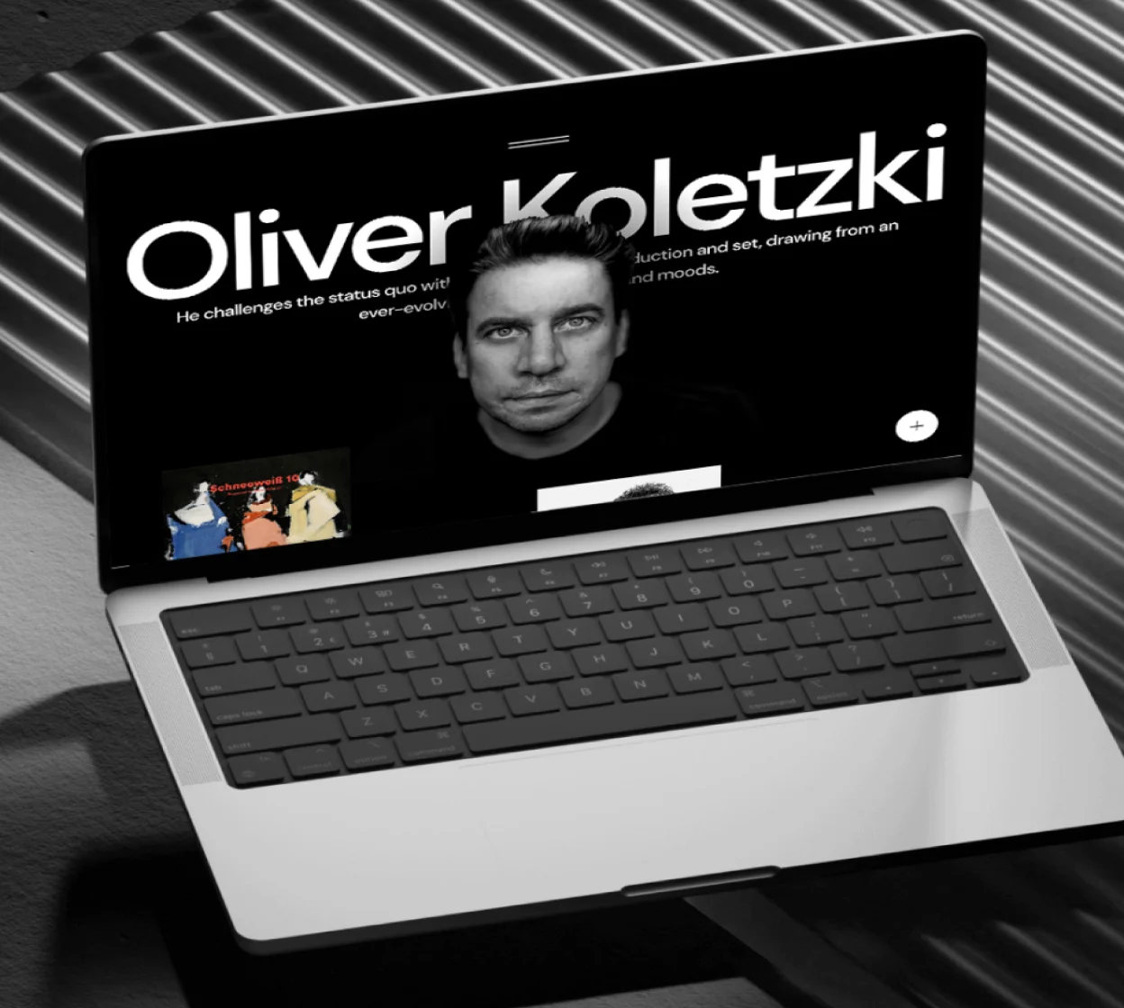
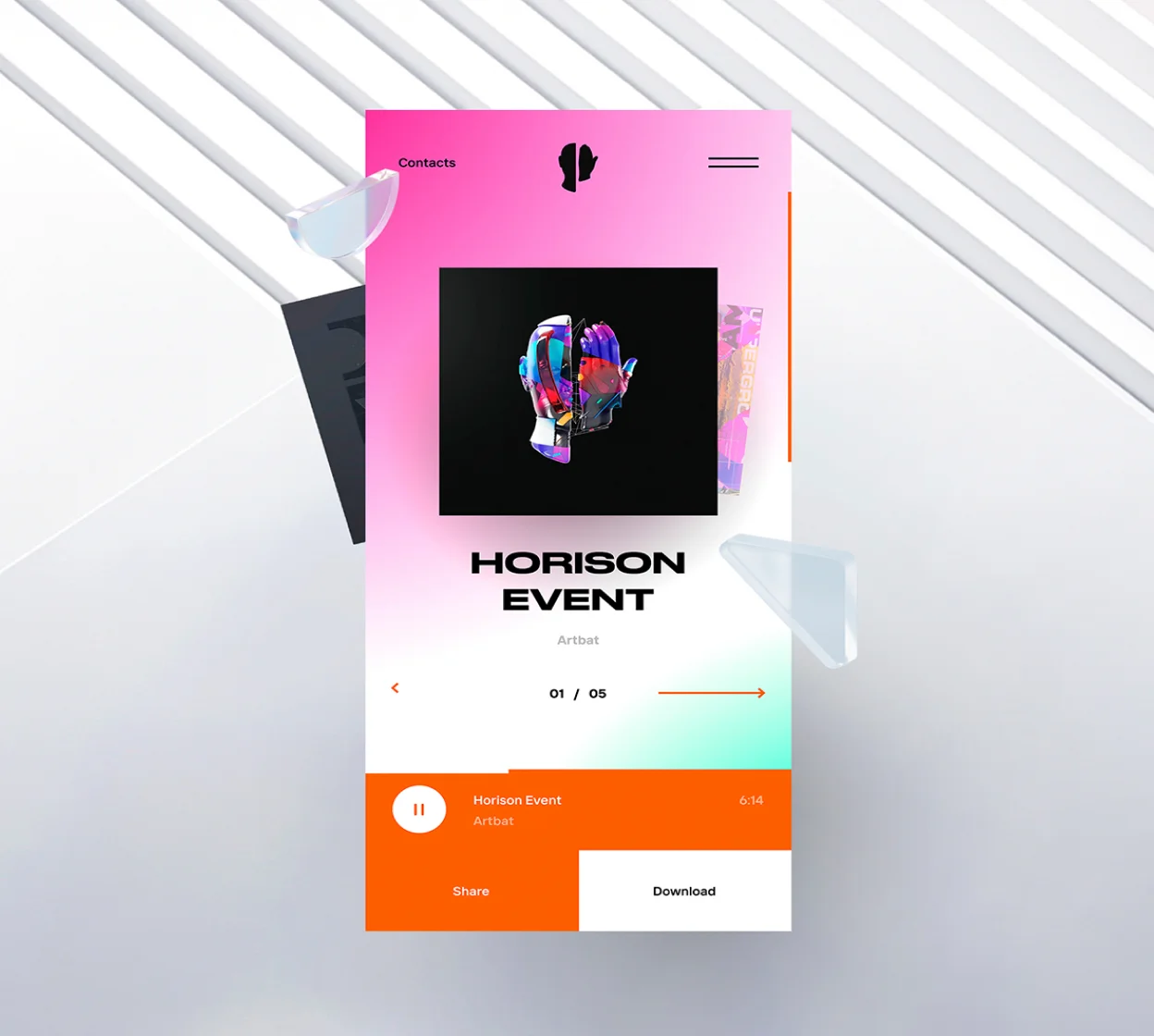
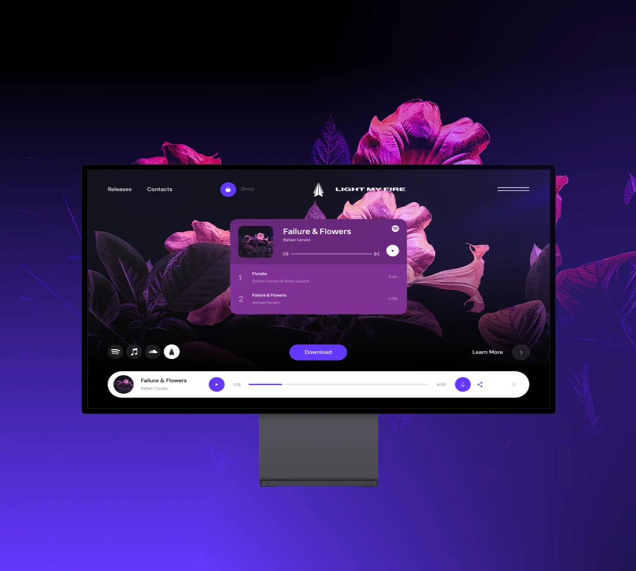
Check out the incredible full case study on Behance
Check out the incredible full case study on Behance
Our cases on the site contain only basic information about working on products, so you can get acquainted in more detail with our approaches and their implementation in full cases on Behance.
Behance Cases